 Back to Home
Centralized Medical Records App UI/UX Design Case Study
The product:
A prototype of a user-friendly mobile medical records app, which corresponds with a website, that is intuitive to use, yet secure. It provides medical information collected over the lifetime of the patient from all hospital systems, states, and cities. The app provides options for the patient to consult their medical providers when accessing medical records so they may learn more about their test results and care, minimizing emotional distress or confusion about test results. It incorporates the latest security technology and is also compatible with the Internet of Things and mobile displays such as smartwatches and tablets, providing convenience and accessbility to patients and caregivers.
Project duration:
January 2019 – July 2019
The problem:
Currently, each medical care stystem in the US provides a separate patient portal. Gathering lifelong detailed health information from various state, cities, hospital systems and specialists for yourself or a person you are caring for can be a nightmare. Doctors often have a very limited view of your health history, such as allergies, past diagnoses, chronic conditions, medications, immunizations, limiting the quality of healthcare they can provide.
The goal:
To design a secure and efficient way for patients to access, store, view, and present their healthcare information over the course of their lifetime, providing a clear and holistic view of their healthcare data, so they are better able to partner with their providers, and have a positive impact overall on their healthcare.
Responsibilities:
User and stakeholder research, market research, problem research and definition, wireframing, prototyping, user testing and analysis
Barriers and Constraints
1. This is one of the biggest challenges facing the nation today
2. We would need to work in accordance with all state and federal regulations, such as HIPAA and Meaningful Use
3. Security and privacy needs to be utmost in importance
4. Urging compliance from all medical systems to cooperate and share records
5. Complex technical requirements in order for all records to be compatible
User research
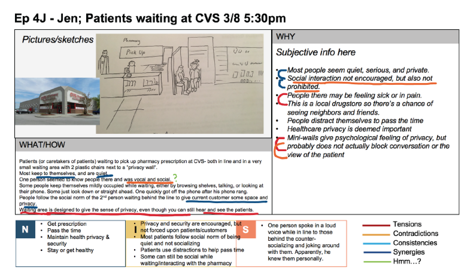
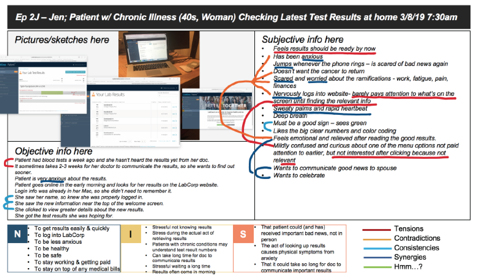
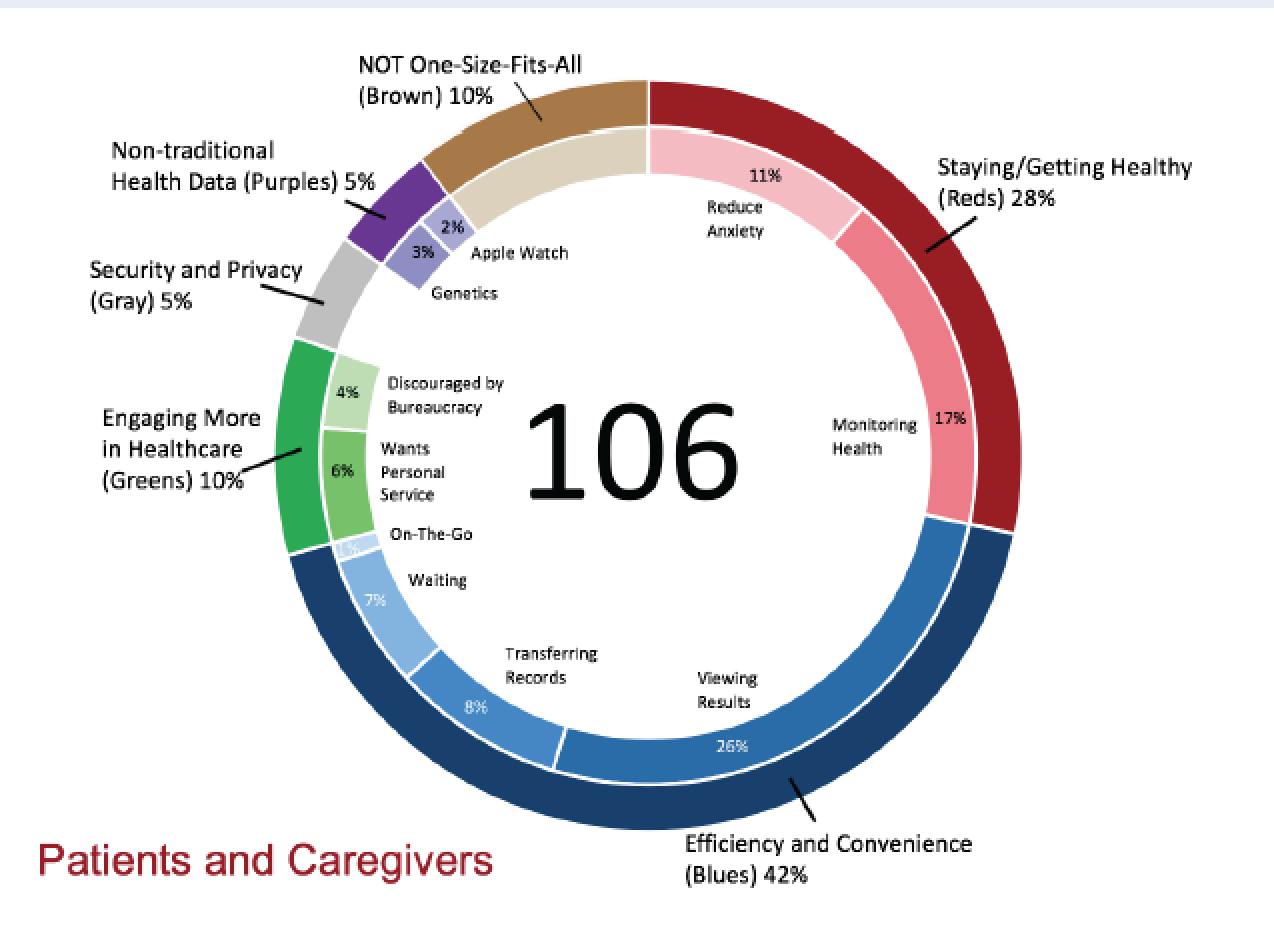
Stakeholder meetings, user interviews and observations, empathy fieldwork , research, testing, and analysis were used to observe and learn the current patient, caregiver, and provider pain points, common user tasks and goals, and context of use. Extensive user testing on the prototype was conducted, with iterations of feedback and updates in a lean agile process.
Stakeholder Analysis
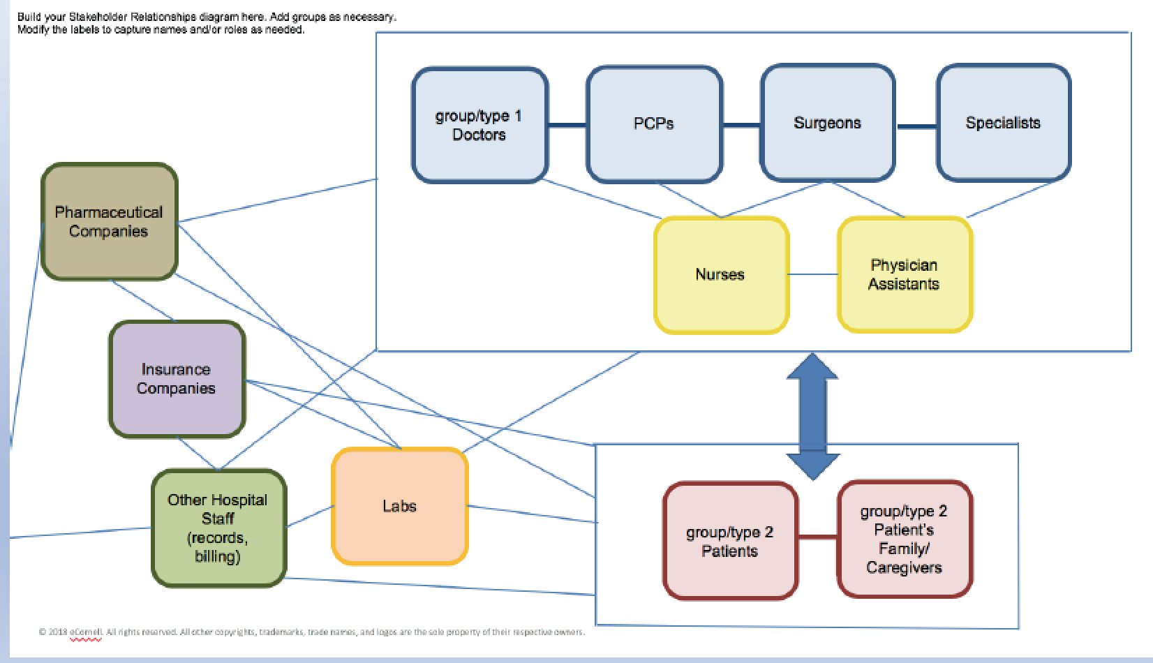
Due to the systematic complexity of the problem, the big picture of all stakeholders involved and how they interact with each other was studied.
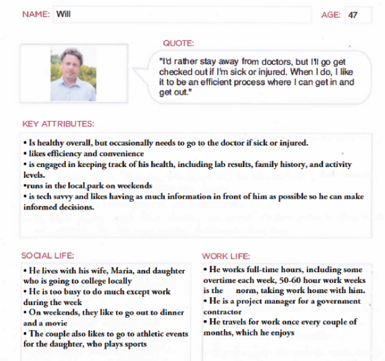
Personas
Based on study of users, personas were developed that captured key aspects, characteristics, needs, and pain points for different categories of users.
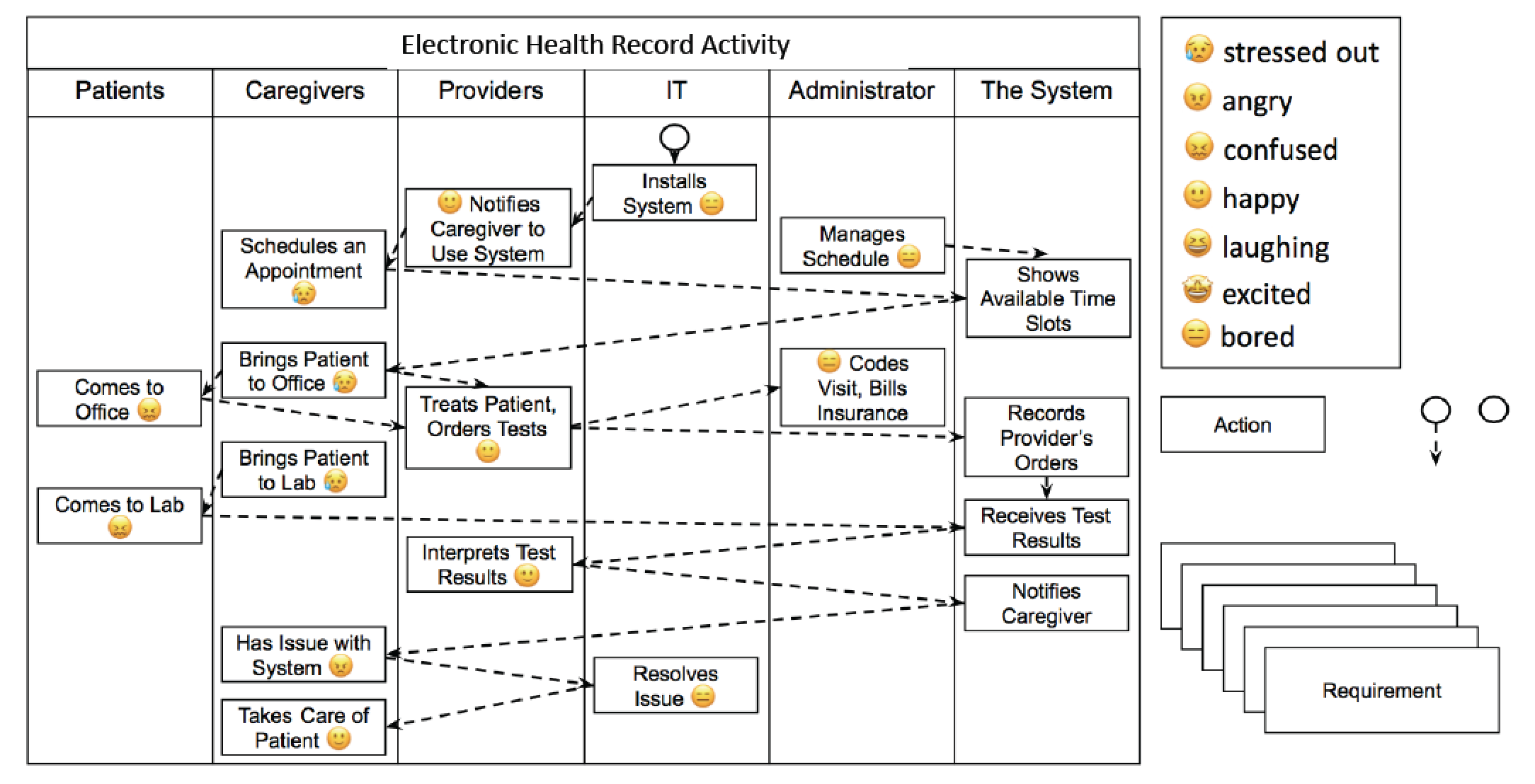
User journey map
Based upon our study of users, their pain points, and their related tasks, the team created a user journey. This helped determine how the app should work and how it can resolve these pain points.
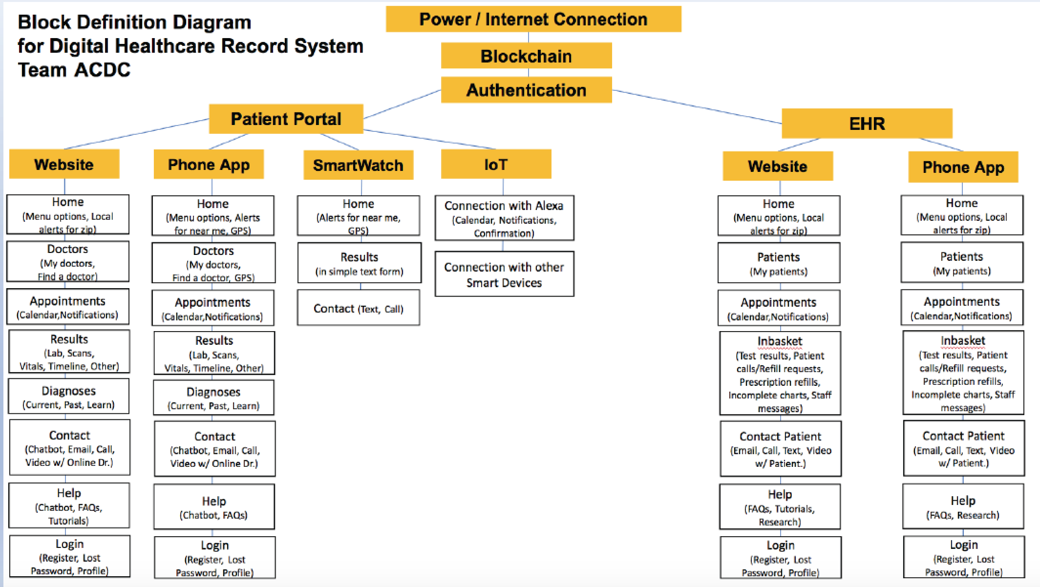
Block Definition Diagram
Due to the complexity of this systemic problem, we took a look at various platforms that would become part of the design solution, and the functionality that would be necessary for these elements.
Competitive Analysis
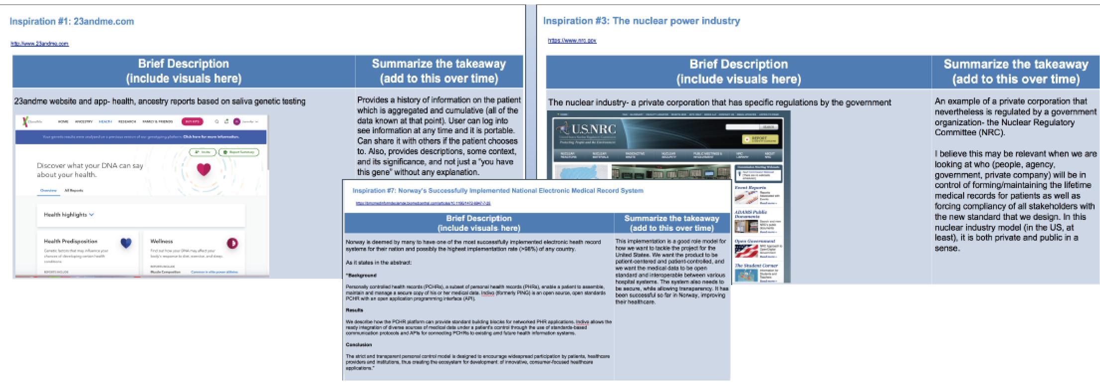
We researched other similar projects in other countries and looked for inspirations in other industries and technologies.
Ideation
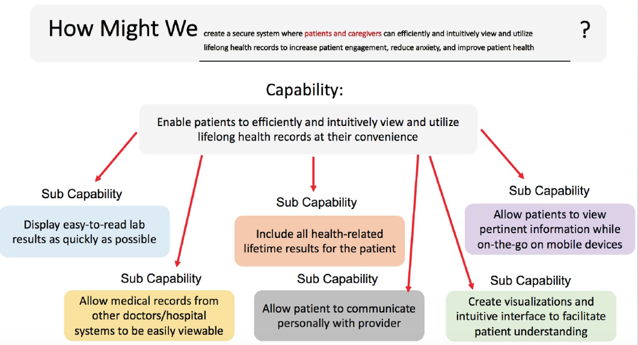
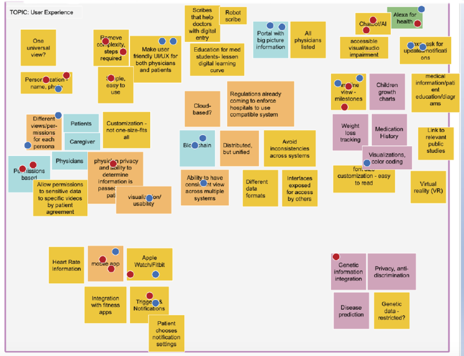
The team performed a How Might We exercise and later had multiple brainstorming sessions, where we voted on the ideas with potential later on.
Paper Prototyping
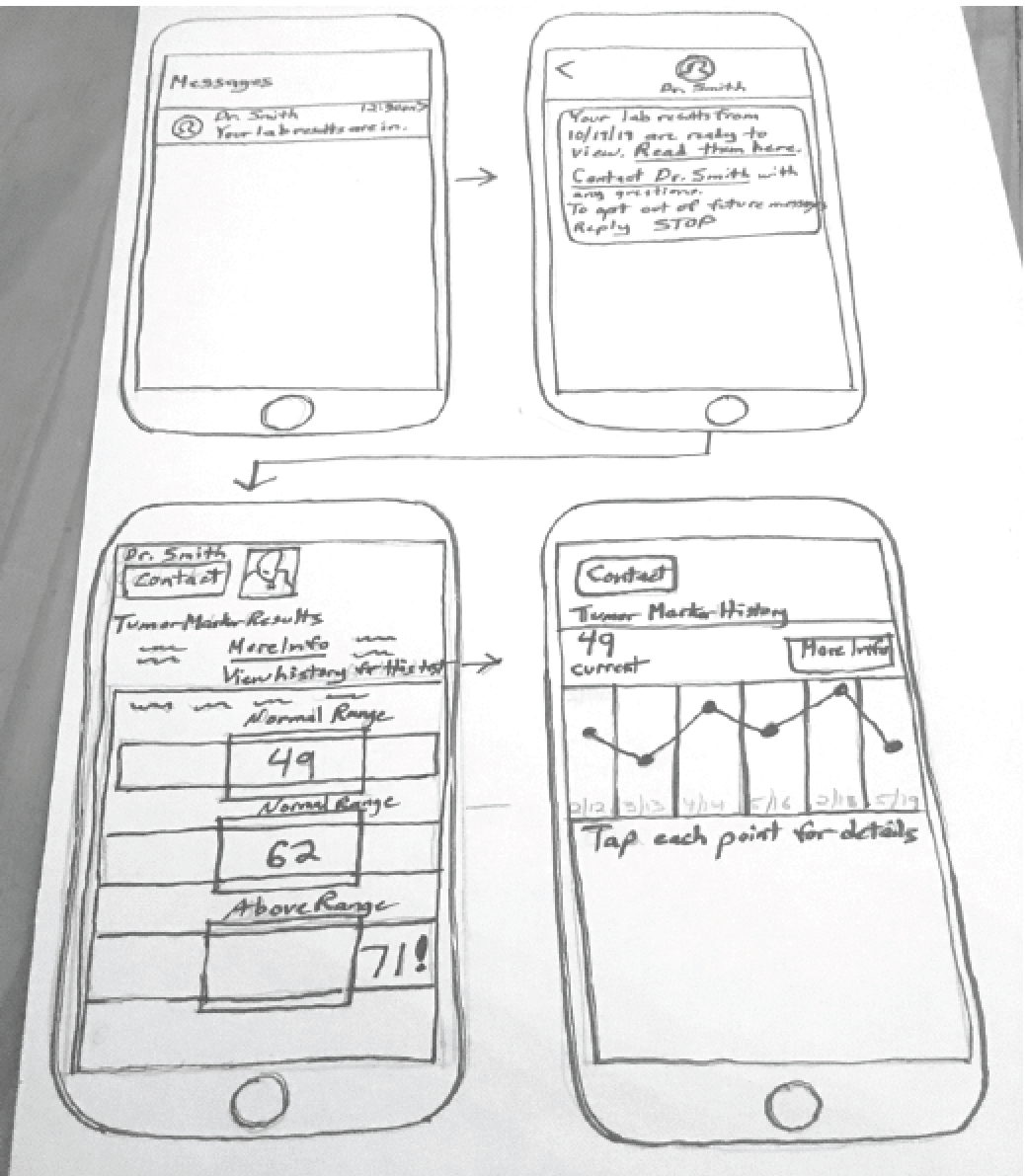
As I sketched design ideas for the screens, I thought about each step the user takes when accessing medical records and using medical services.
Usability Testing of the Paper Prototypes
We each performed usability testing of our paper prototypes, using a series of pre-determined tasks and a list of questions.
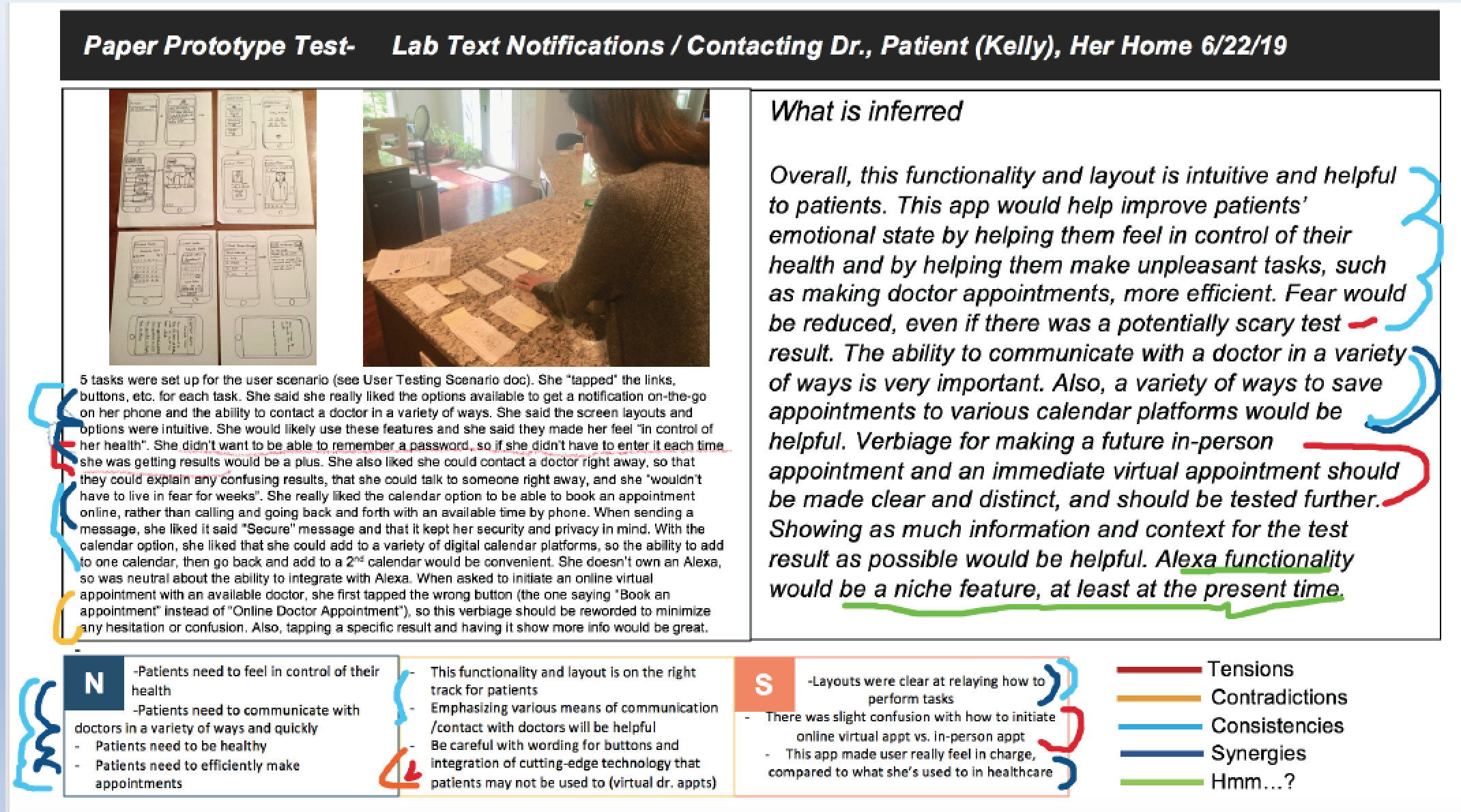
Study type: Moderated usability study of paper prototype
Participants: 5 testers, varying ages and genders
Location: Carrollton, VA
Length: Over two days, in five 30-minute sessions
Usability Study Findings:
Testing at this stage determined that the concept, layout, and functionality were well-received and had potential to be successful. The purpose of a couple of the buttons provided some confusion to a couple users, but it was determined that clearer verbiage and on-screen assistance would remedy this problem. Testers liked the various options presented and would love to have these capabilities offered.
Digital wireframes
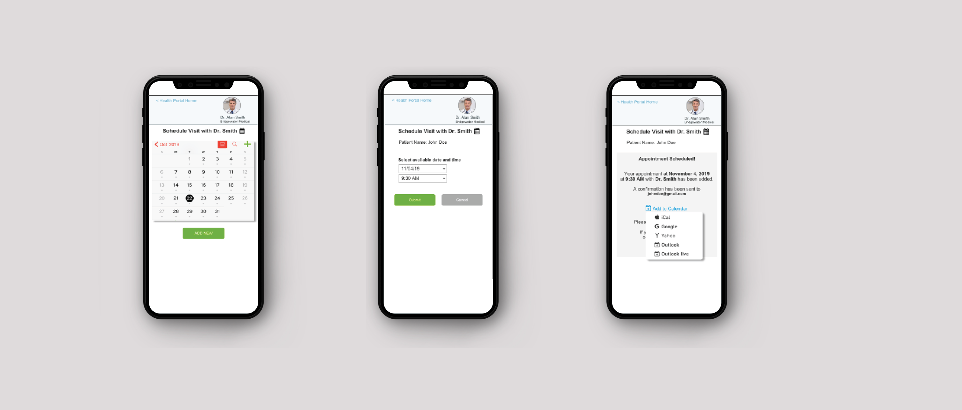
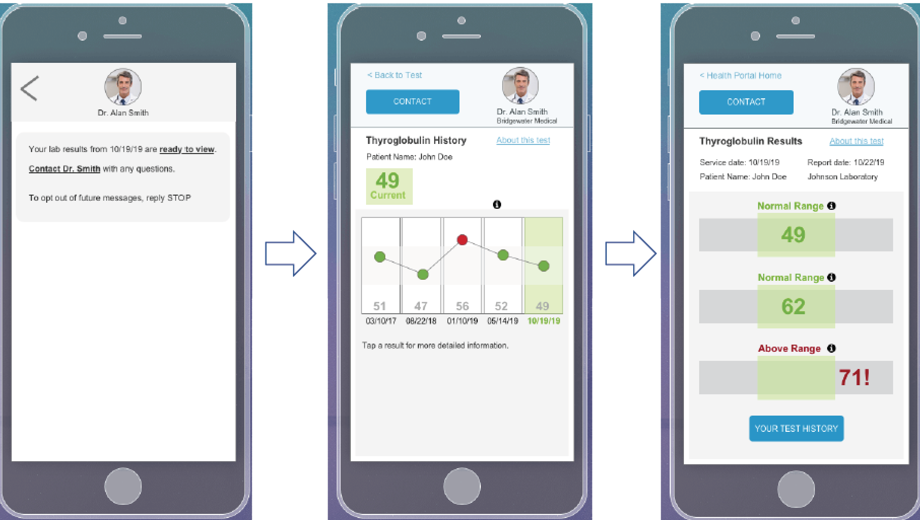
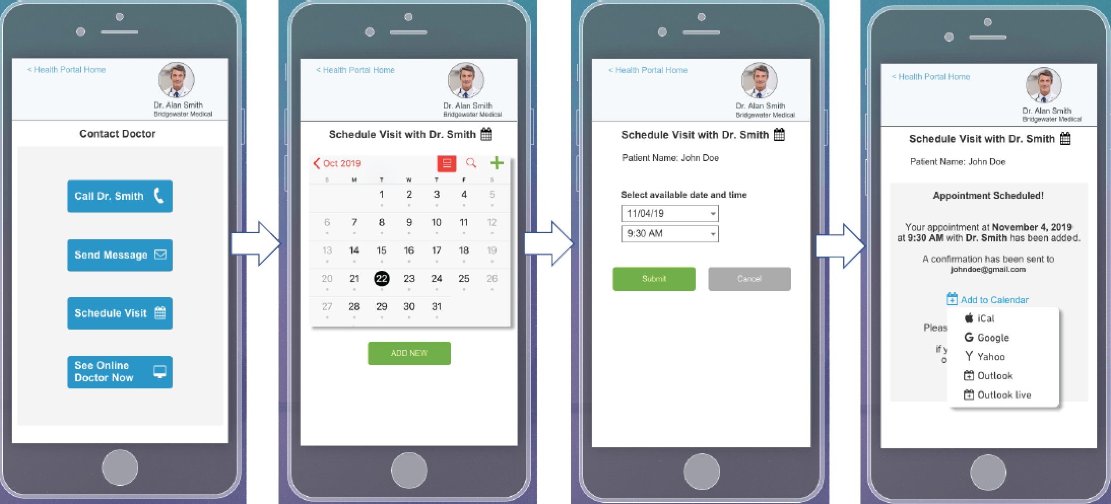
User feedback and pain points informed design decisions in order to increase usability. Based upon paper wireframes, I created digital mockups for the mobile screens for a typical user flow.
Accessibility considerations
1. Clear terminology is used and options offered for users to learn more information about medical terminology
2. Meaningful iconography and color-coding are used to aid understanding
3. Video and audio options are available whenever feasible
4. Common design patterns are used, for example, as with calendar bookings
Takeaways
Impact:
The prototype was well received by user testers and stakeholders because this app would solve many of their issues. Patients expressed that this app would let them be in control of their own healthcare. Physicians indicated this would make their jobs easier, more efficient, and more effective
What I learned:
I learned that with the proper analysis of all the elements involved in a complex systematic problem, that progress can be made toward's solving the world's biggest issues.
 Back to Home
 To Top of Page
Contact
Email: jenlycke@gmail.com
Phone: (757) 477-1244
