 Back to Home
Just For Fun - Pig Statue Public Art Project
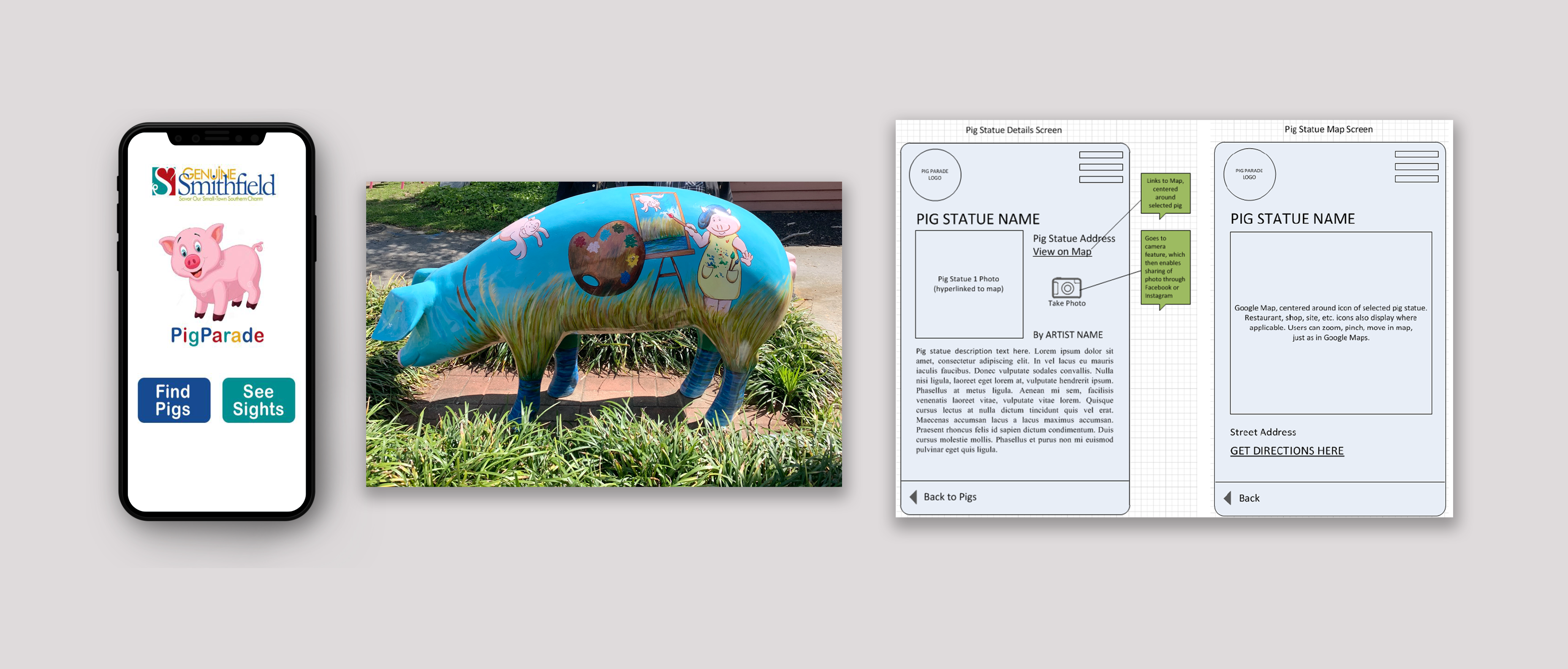
The product:
A prototype of an interactive smartphone app for visitors of Smithfield, VA to locate the 8 painted pig statues throughout downtown
Project duration:
June 2015 – August 2015
The problem:
Although there was a tourism brochure listing the painted pig statues in town, it is not apparent for newcomers to find their locations. A related app would bring more visitors and more tourism revenue to town.
The goal:
To create a fun interactive app that helps people and families hunt for the 8 pig statues in town, making downtown even more of a tourism destination, and increasing tourism revenue
Responsibilities:
User research, brand research, information architecture, and wireframing
User research
Interviews and surveys were conducted to learn more about potential users and visitors to the town and their interest in this app
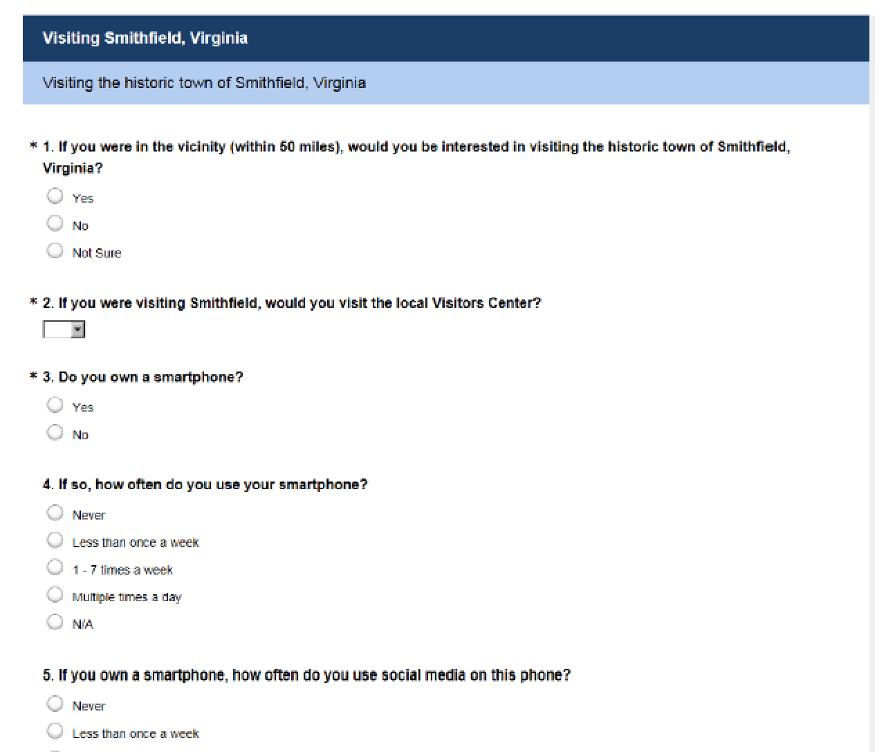
Key User Insights:
- 84%of survey takers were interested in visiting the town.
- Almost all responders have smartphones and use them daily. 84% use social media on their phones and 94% use GPS on their phones. Therefore, this functionality in the app would most likely be used.
- 74% would go to the Visitors Center if visiting town. Therefore, advertising the app at the Visitors Center would be the logical place.
- Most indicated that they would be in groups of 1-4 people for their town visit. So, enabling the pig hunt as a group or individual activity would be appropriate.
- There was a wide range of ages in responders. So, enabling an activity that's fun for all ages would be appropriate.
- 79% of responders were favorable towards public art. So, there seemed to be enough potential interest in the topic.
- Most responders had a great amount of interest in various activities located close to the pig statues, particularly restaurants, historic sites, shopping, as well as public art, galleries, and outdoor recreation. Therefore, visitors using the app would likely be interested in seeing and spending money at the local attractions.
Competitive Analysis
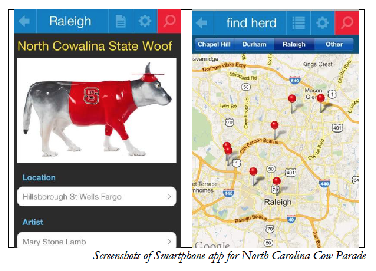
Similar apps in other geographic locations were analyzed for features and functionality.

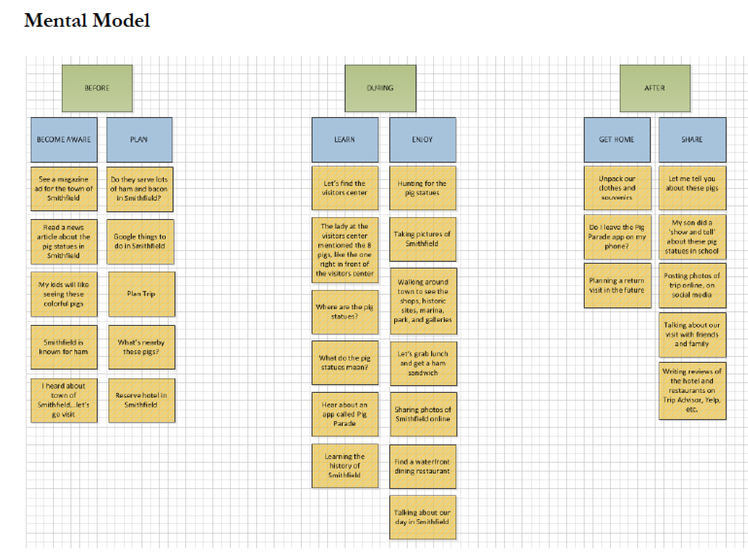
Mental Model
Based on insights about users, I developed a mental model of what visitors would think about before, during, and after their town visit. This would help determine user flows and features for the app.
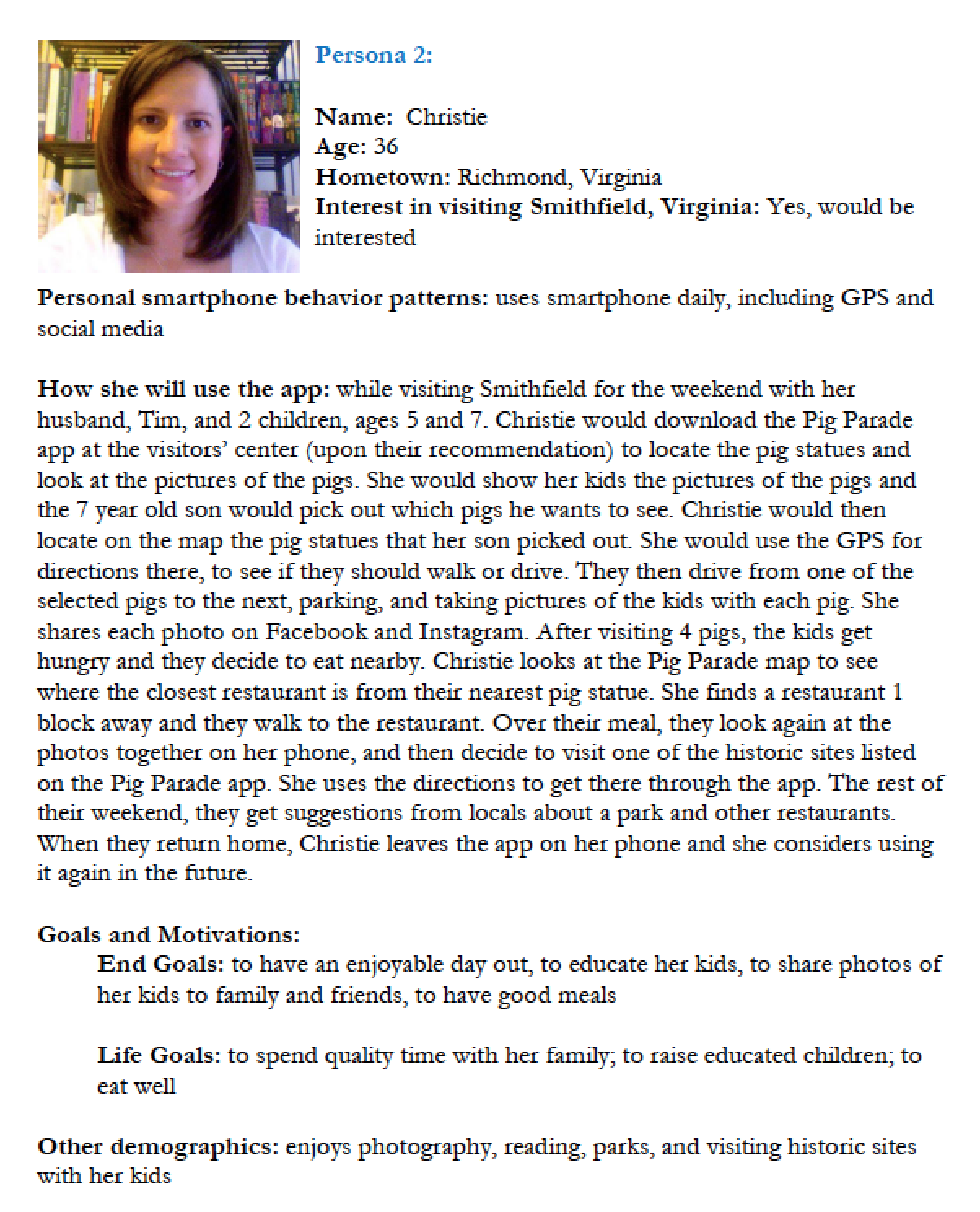
Personas
Based on study of users, personas were developed that captured key aspects, characteristics, needs, and pain points for different categories of users.
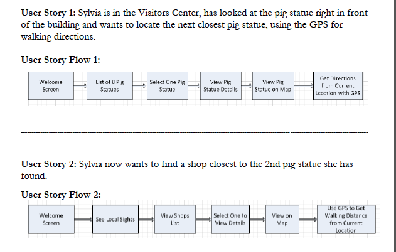
User Stories
Based upon the personas, user stories were written to describe the personas' wants and needs.
Branding and Lexicon
The personality of the brand was determined and a visual lexicon was established, which defined the look and feel, such as color, fonts, and iconography. Also, the tone and voice of the app were determined, specifying the mood and type of language to be used in text instructions, and field descriptions. All of these aspects were thought about, to present an appropriate and cohesive product.
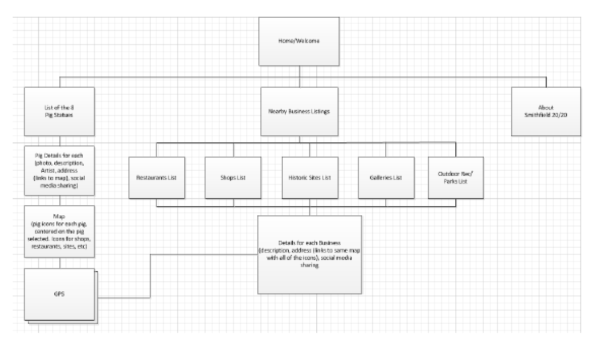
Site Map
A site map was developed based on the previous exercises. The user stories were considered to help determine the most intuitive information architecture for patients.
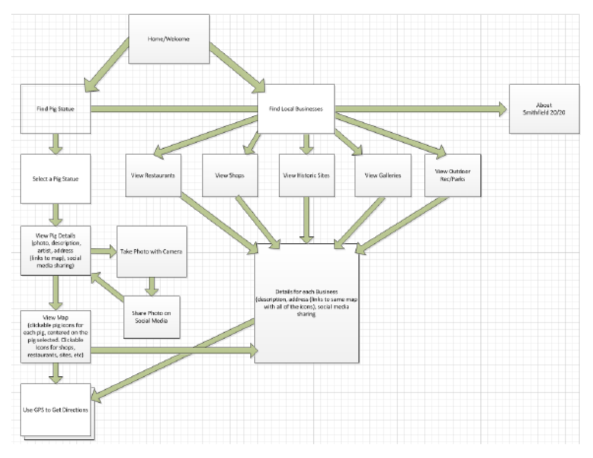
User Flow Diagram
Based upon my information architecture exercises, I thought about each step the user takes when visiting town and accessing the app.
Digital wireframes
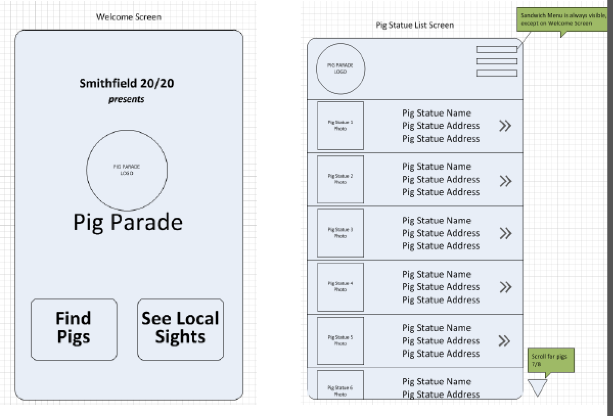
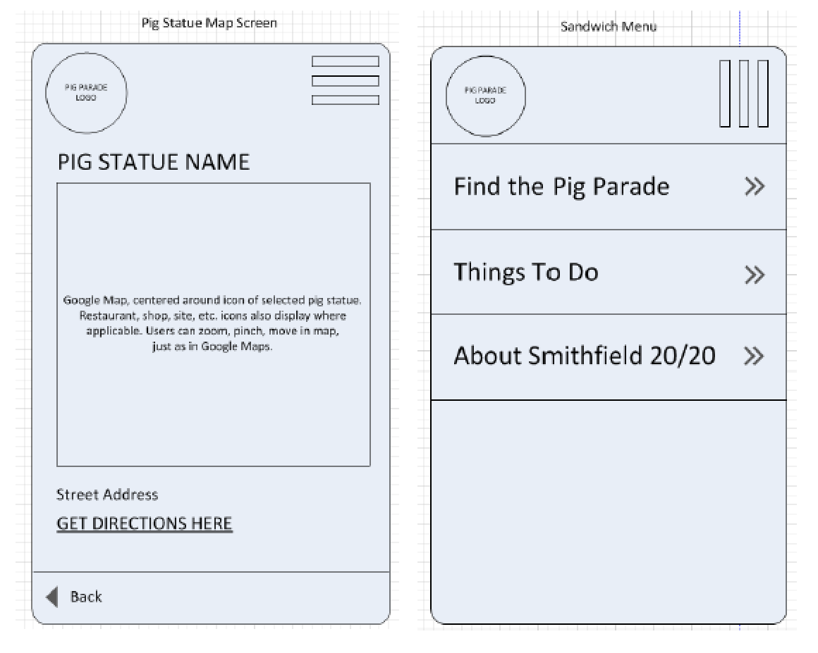
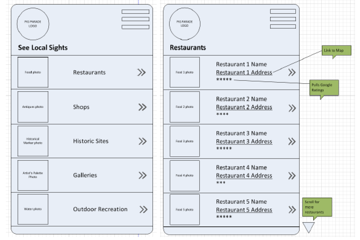
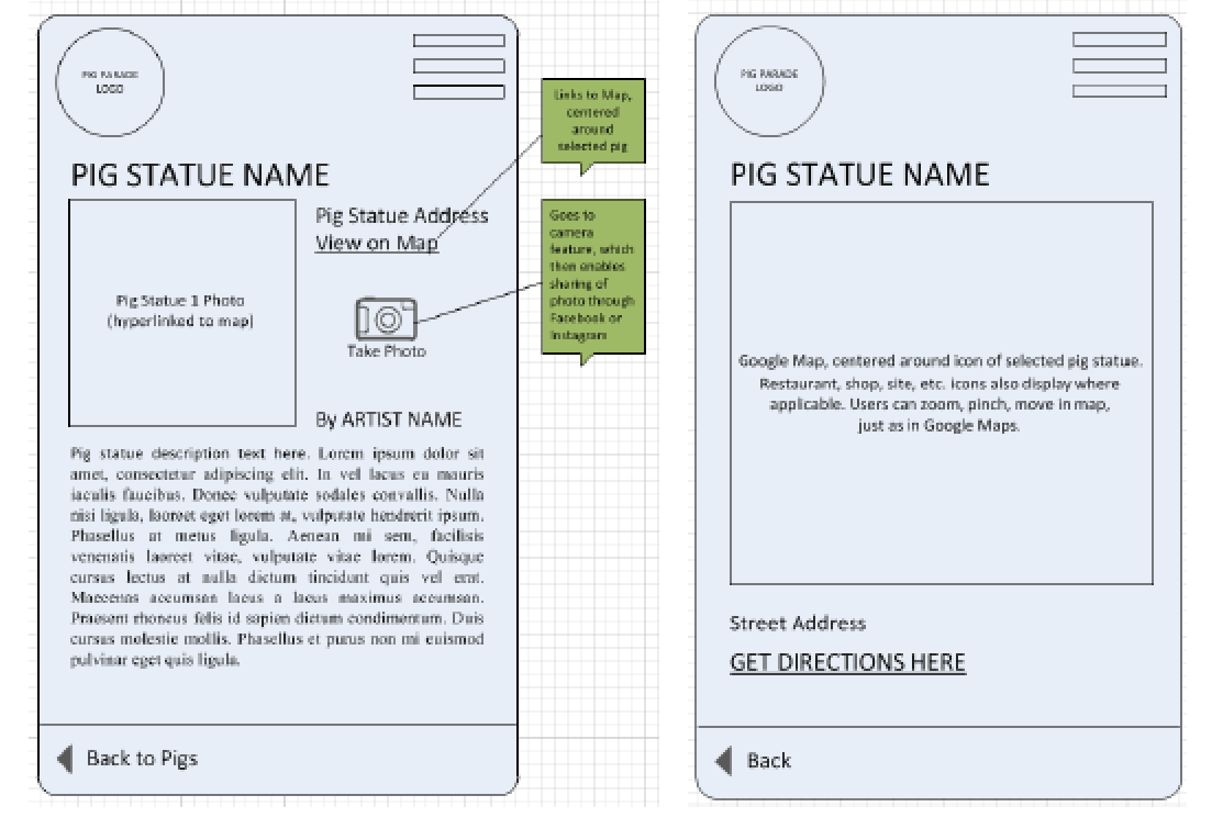
I created digital wireframes for the mobile screens for a typical user flow, keeping in mind the features that users would want.
Accessibility considerations
1. Meaningful iconography and color-coding are used to aid understanding
2. Buttons are large, clear and easy to understand
3. Both photos and text descriptions are used
Takeaways
Impact:
The prototype received positive feedback and it was indicated that this would be a fun activity that would help lure families to visit the downtown area.
What I learned:
I learned that by seeing a gap in one's local market, a popular product that is enjoyed by many can be created. Listening to feedback from potential users can help develop a successful product.
 Back to Home
 To Top of Page
Contact
Email: jenlycke@gmail.com
Phone: (757) 477-1244
