
UI/UX Designer
 Back to Home
 FoodFinder App and Responsive Website Design UI/UX Case Study
FoodFinder is a phone app and responsive website designed to help combat food insecurity. FoodFinder helps people find free and low-cost nutritious food options near their home and find affordable transportation options to access that food.
Project duration: August 2021 – October 2021
The problem: There are too many people that are hungry and in sub-optimal health because they and their families cannot afford or access nutritious food in their neighborhoods.
The goal: To enable people with limited income or living in food deserts to find nearby sources of nutritious food, and help them find affordable ways to get transportation or delivery so they can obtain nutritious food
My role: UX designer and UX researcher
Responsibilities: User research, market research, wireframing, mockups, prototyping, user testing and analysis
User research
I performed a Moderated Usability Study with 5 users each in 2 rounds of user testing. In the 1st round of testing, users were asked to interact with a low-fidelity prototype presented on a smartphone and were verbally asked a series of prompts and prompt follow-up questions. In the 2nd round, users were asked to perform additional tasks with a high-fidelity prototype.
Assumptions going into user testing were that the app would be helpful people living in a food desert or needing financial assistance with feeding themselves and their families and that the app was easily to navigate. Overall, the testers confirmed these assumptions and were pleased with the app capabilities. However, there were some issues raised when it came to following transportation route options. Based upon this feedback, these issues were corrected with multiple iterations of design updates.
Personas
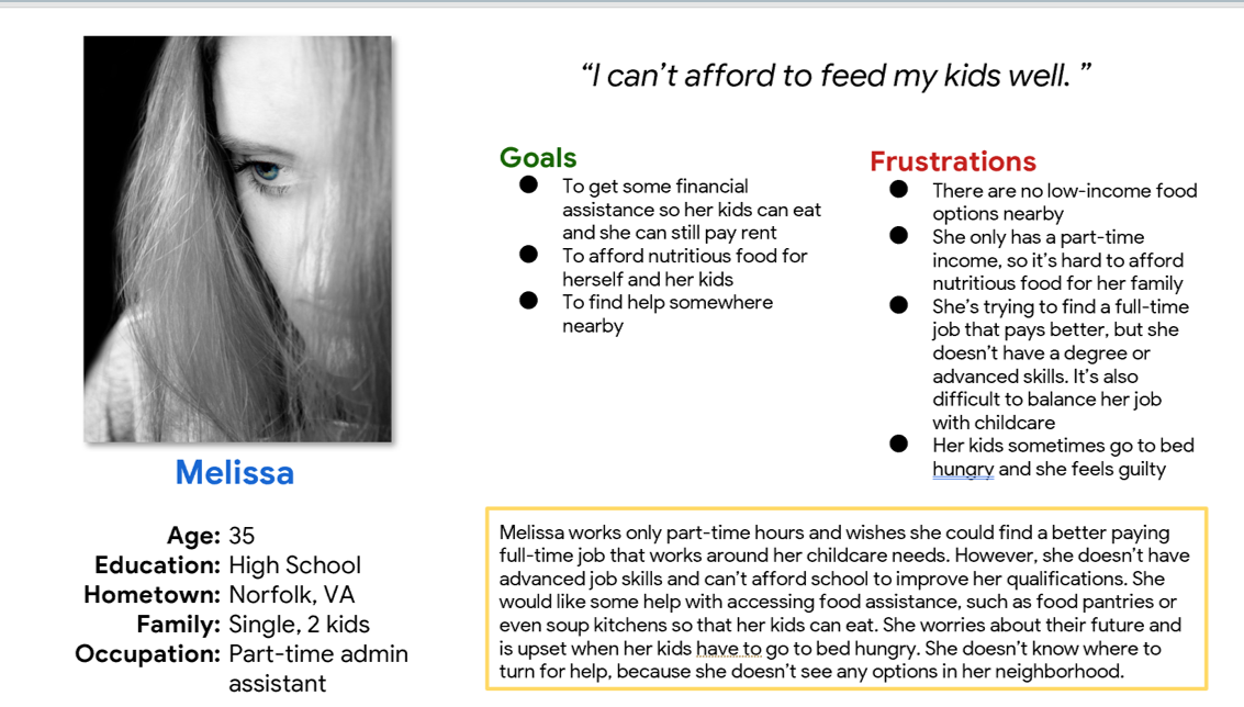
Problem statement: Melissa is a struggling mother who needs to be able to feed herself and her kids because they sometimes go to bed hungry and she wants them to be healthy with a bright future.
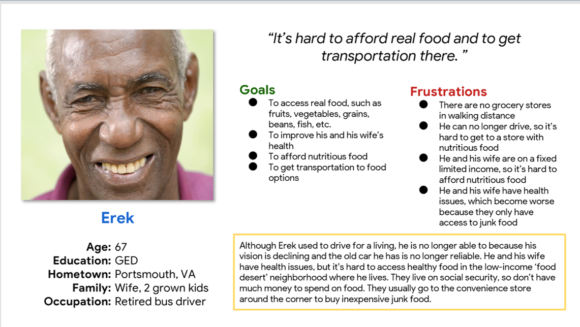
Problem statement: Erek is a retiree with a low fixed income who needs to feed himself and his wife nutritious food because he no longer wants junk food and wants to maintain their health.
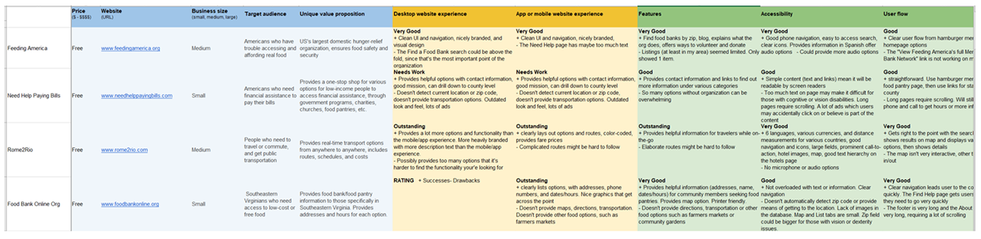
Competitive audit
Conducted an analysis of other websites offering similar services and functionality to determine their strengths and weaknesses, and gaps in the market.
Ideation
With pen and paper, I brainstormed interfaces that would help users get started searching for nearby food sources and finding relevant information on their phones.
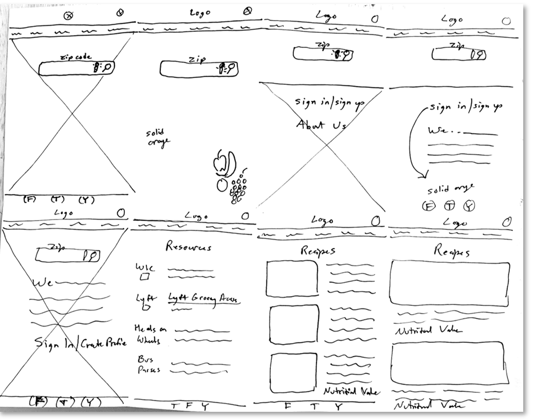
Digital wireframes
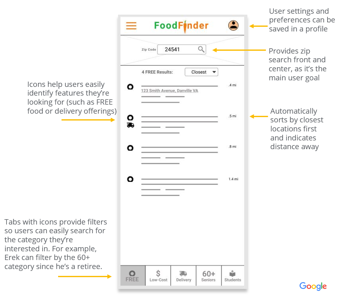
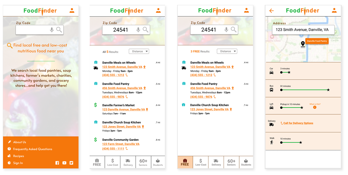
Users needed a simple way to determine what food offerings are near their own home, so I kept the interface straightforward with an emphasis on the zip search field, which can be searched by typing or voice. Results can be sorted and filtered according to their own needs. Users are also able to save their settings (such as location, transportation preferences, and user category) to make reusing the site easier.
Low-fidelity prototype
I explored the various screens needed for the app for the main user flows and how these would connect to each other for the user journey.
Link to Low-Fidelity App Prototype
Usability Study
Study type: Moderated usability study
Participants: 5 participants
Location: Carrollton, VA
Length: 20 minutes per session
Usability Study Findings:
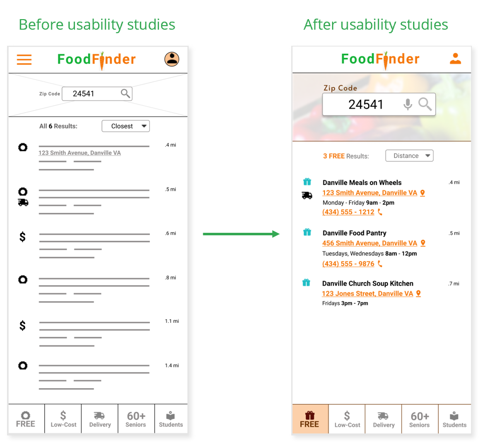
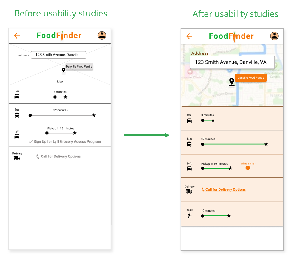
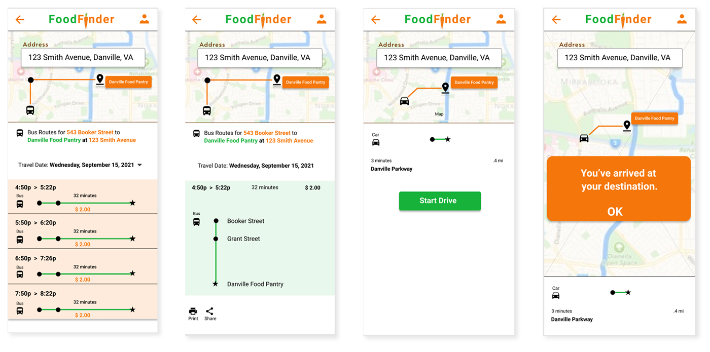
1. Some users wanted a walking option. 1 out of 5 participants would likely walk to a nearby food source, so wanted to have a walking directions available as an option.
2. Cognitive or vision issues make it hard to understand transportation options. 2 out of 5 participants had cognitive/vision issues which made it difficult to understand the various transportation routes presented.
3. Most users could easily perform zip code search. 4 out of 5 users found it easy to do a search by zip code, quickly finding relevant search results.
Mockups
After testing indicated that users with cognitive/vision impairments may have difficulties, I updated the design to aid understanding by:
• Including the option of automatically detecting user’s zip code based upon GPS
• Added voice search option to improve accessibility
• Increasing size of the search field and zip code text
• Increasing margins to improve readability and allow room for touch actions
• Adding location and phone icons to aid understanding
• Using color to help understanding and visibility
After further testing indicated that users with cognitive/vision impairments may have difficulties, I updated the design to aid understanding by:
• Adding a walking route option
• Cleaning up the route information to aid readability
Mockup Examples
Design System
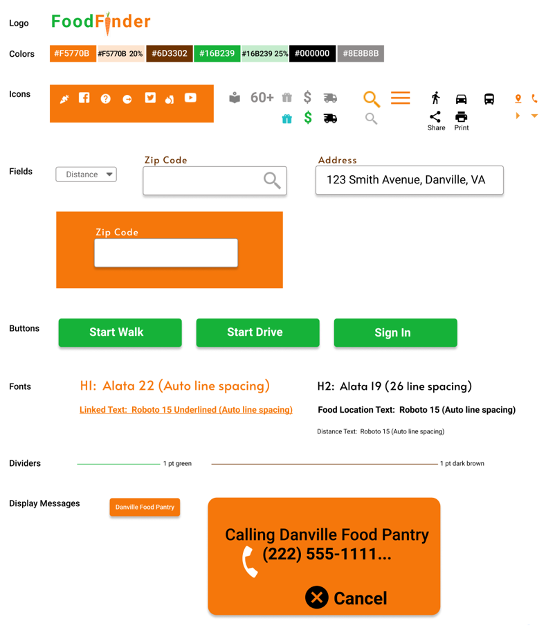
I added visual components and assets to a sticker sheet design system, to improve consistency and branding and to help designers and developers
High-fidelity prototypes
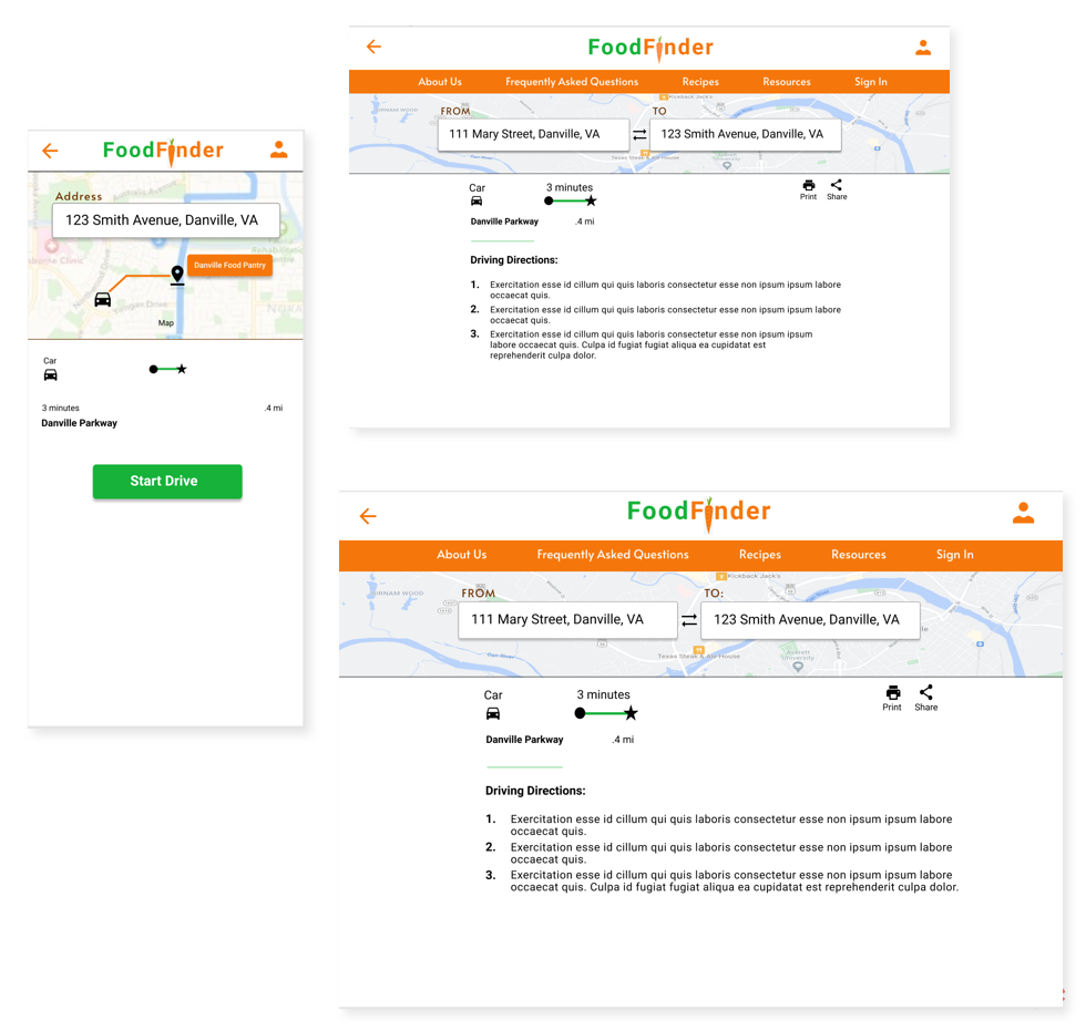
I created high-fidelity prototypes for various screen sizes
(phone app, mobile site, tablet, desktop)
Accessibility considerations
1. Includes option for automatically detecting zip code to ease use for those with cognitive/vision disabilities
2. Includes voice search option for zip code, for those with vision disabilities
3. Provides various transportation options for those who cannot drive, but can walk or use public transportation
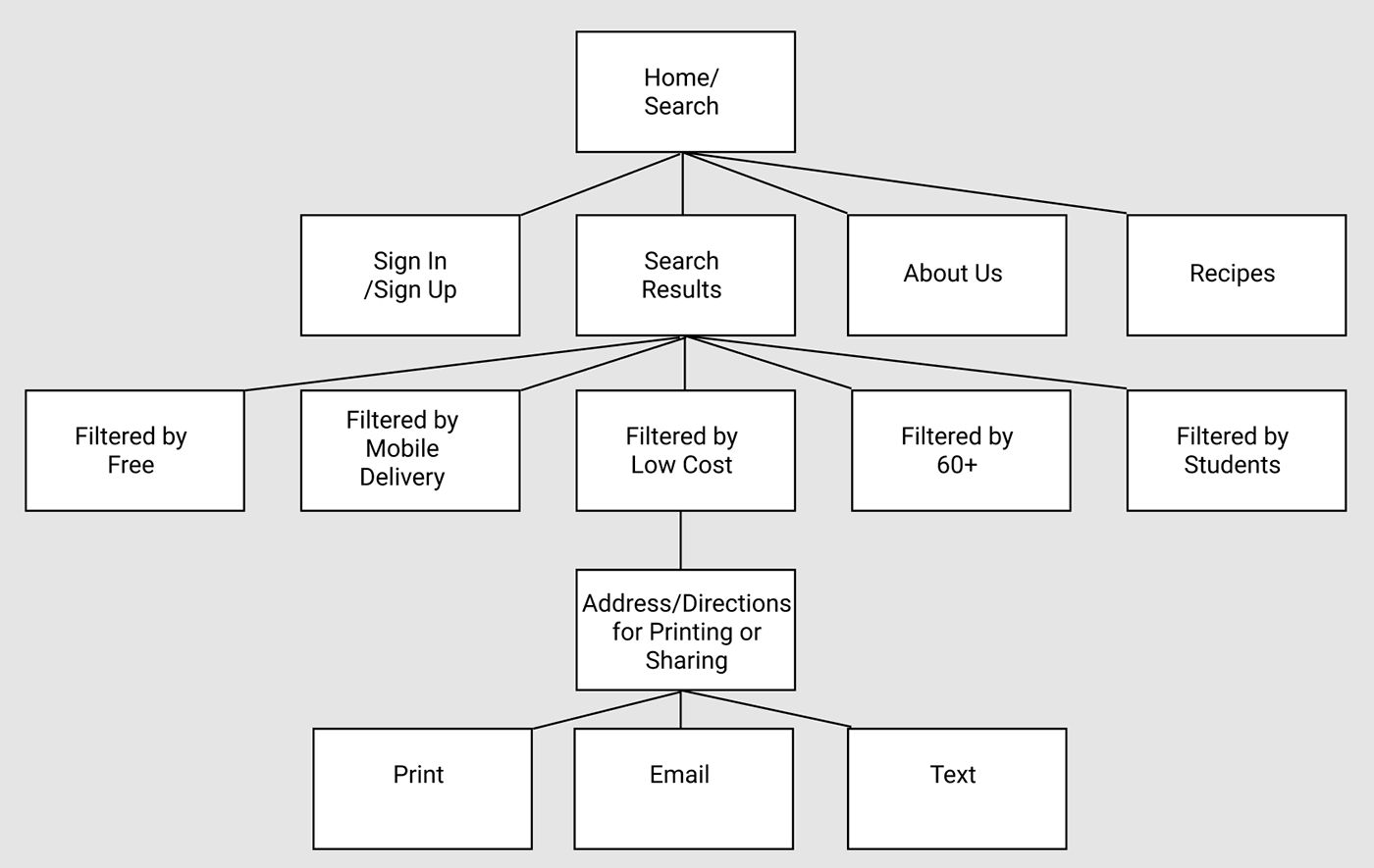
Sitemap
I studied the user journeys and related tasks of our personas to determine the flow of the app, and the screens necessary for users to proceed through that flow.
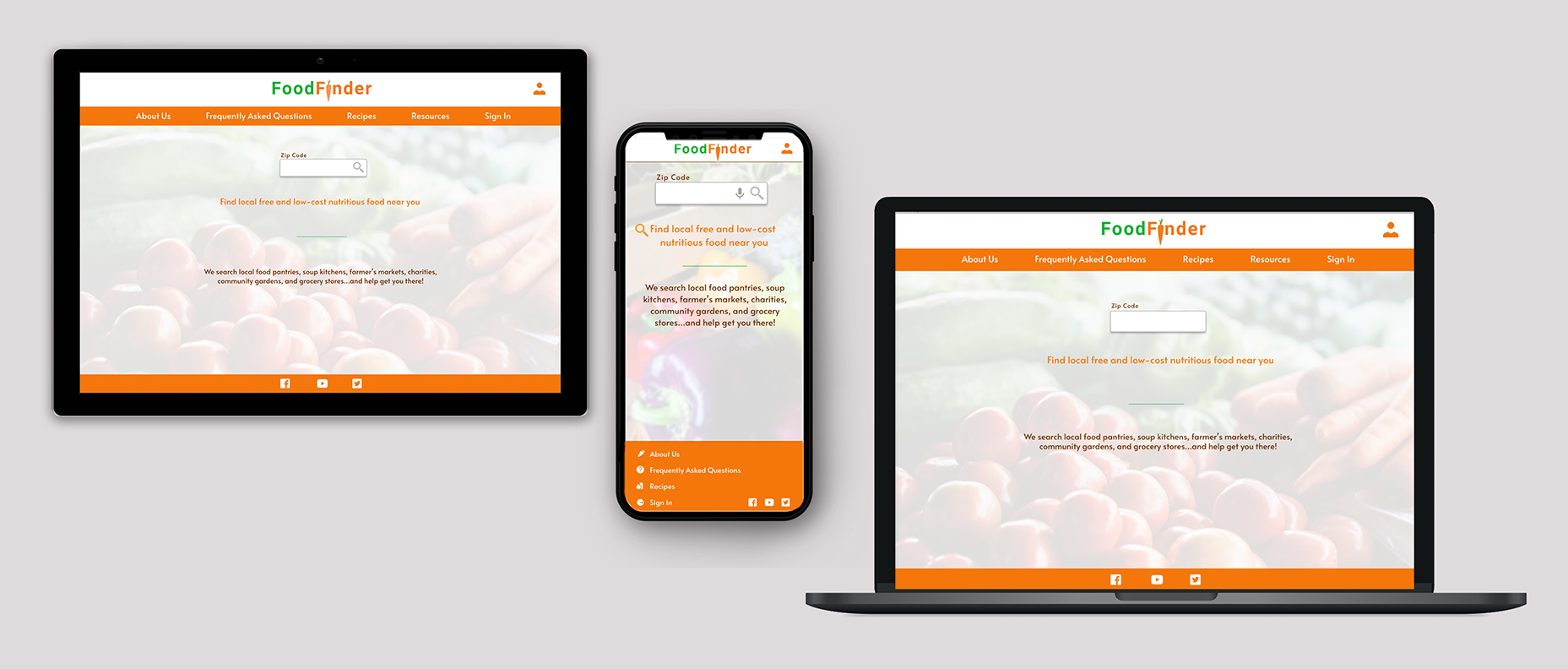
Responsive designs
I designed the interfaces for multiple device sizes, accounting for screen size and device functionality (for example, most desktop computers would not have GPS but may have access to printers)
Takeaways
Impact:
This app and website could help people who need financial assistance for food to find local resources that they did not know about. It could also help those who are transportation-challenged to find affordable ways of getting to these food resources or setting up delivery. As one tester said “This site would really help out my family when we are hungry and need help.”
What I learned:
In addition to learning more of the nuances of designing with Figma, I learned that we need to design for a variety of situations and end-user capabilities. People have different device sizes, with varying ranges of capabilities. People also vary in technical, cognitive, and visual aptitude and may present other disabilities (such as no longer being able to drive). We need to design to be inclusive of these diverse capabilities.
Next Steps
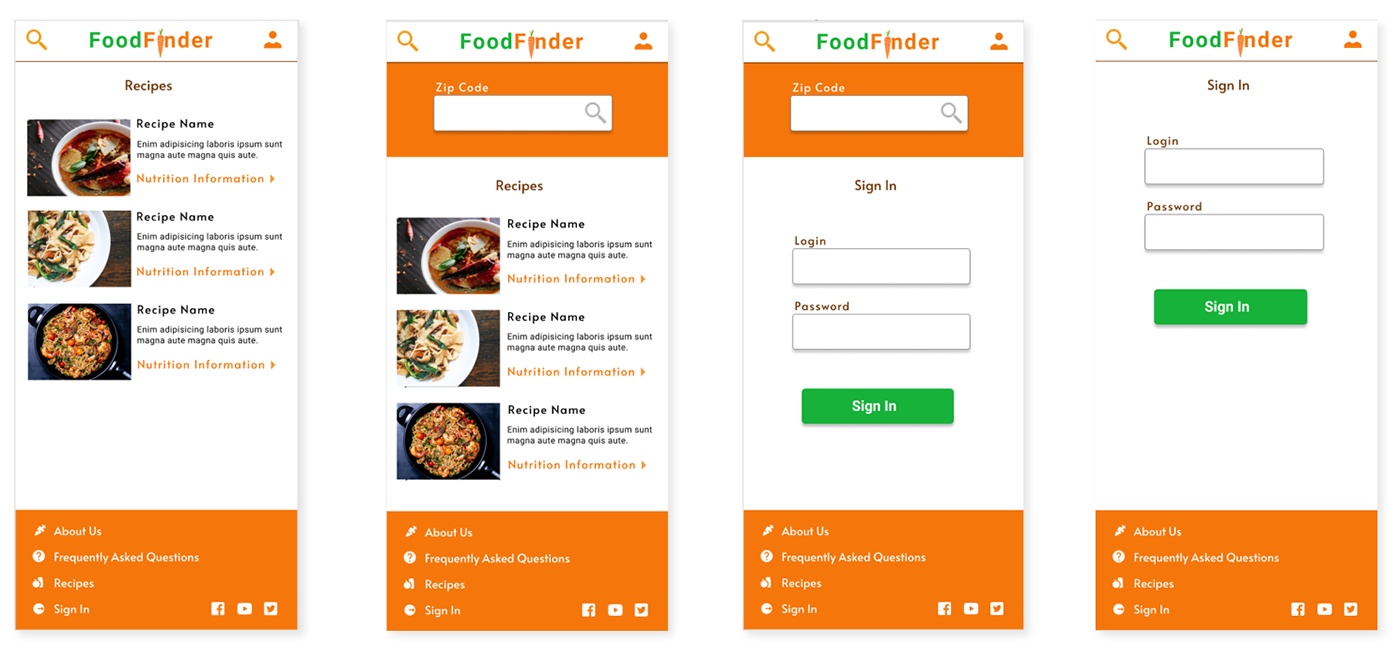
1. Next, I would continue to build out all the other user flows, such as providing detailed financial assistance resources, building a recipe database, and designing the settings screen/login flow.
2. I would add all page designs to all device sizes, keeping in mind screen limitations and the strengths and weaknesses of each device type.
3. I would then conduct further usability testing to make sure all pages, including the resources, recipe, and login sections, are user-friendly and accessible.
Back to Home
To Top of Page
Contact
Email: jenlycke@gmail.com
Phone: (757) 477-1244


Just For Fun

