 Back to Home
Kayak Reservation App Design UI/UX Case Study
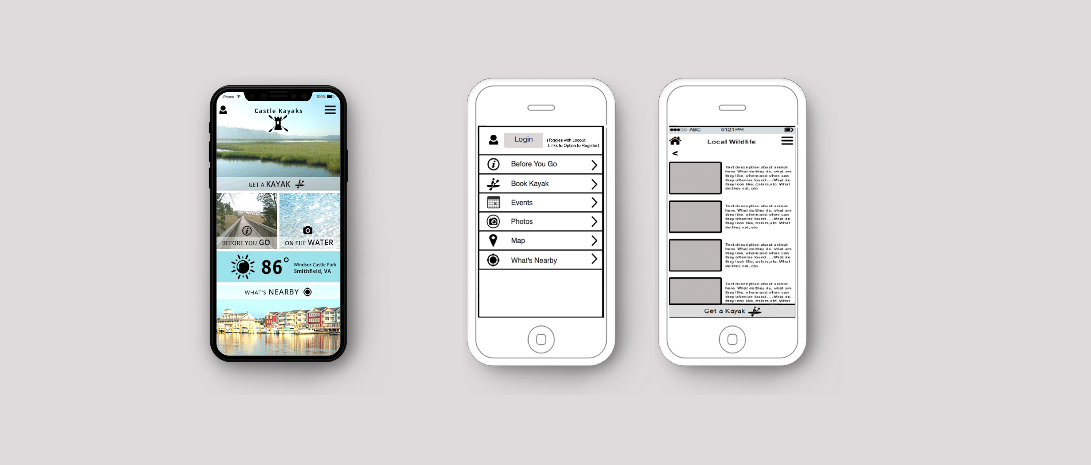
The product:
A smartphone app that books reservations for kayaking. It includes weather forecasts, notifications, timers, GPS and map functionality, as well as information about safety, wildlife, events, and the local area.
Project duration:
August 2016 – November 2016
The problem:
The existing park reservation system was inefficient, forcing customers and the outfitter to play "phone tag". This discouraged use of kayaks, which led to less people visiting the park and less spending of tourism money by out-of-town visitors.
The goal:
To encourage users to explore the park through kayaking with an easy-to-use, informative, and fun mobile app that guides users through the kayak rental process, from start to finish. To invite users to utilize park facilities and visit nearby attractions with a socially interactive interface.
My role:
- User research
- Competitive Analysis
- Wireframing
- Mockups
Business Objectives:
- To increase awareness about the park facilities, particularly the state-of-the-art kayak launch
- To increase visitors to the town by 10%
- To encourage user downloads of Castle Kayaks phone app
- To increase first-time kayak rental sales by 50%
- To increase return customer kayak rental sales by 50%
- To increase park kayak rental revenue by 50%
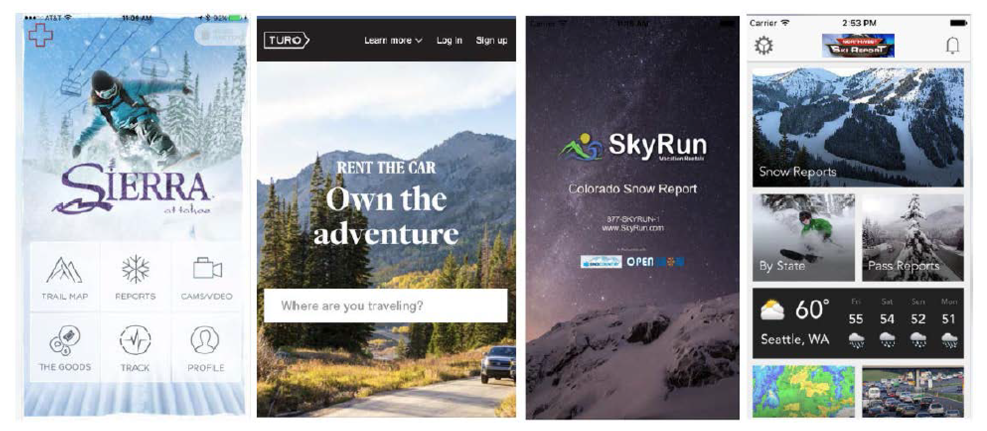
Competitive Analysis
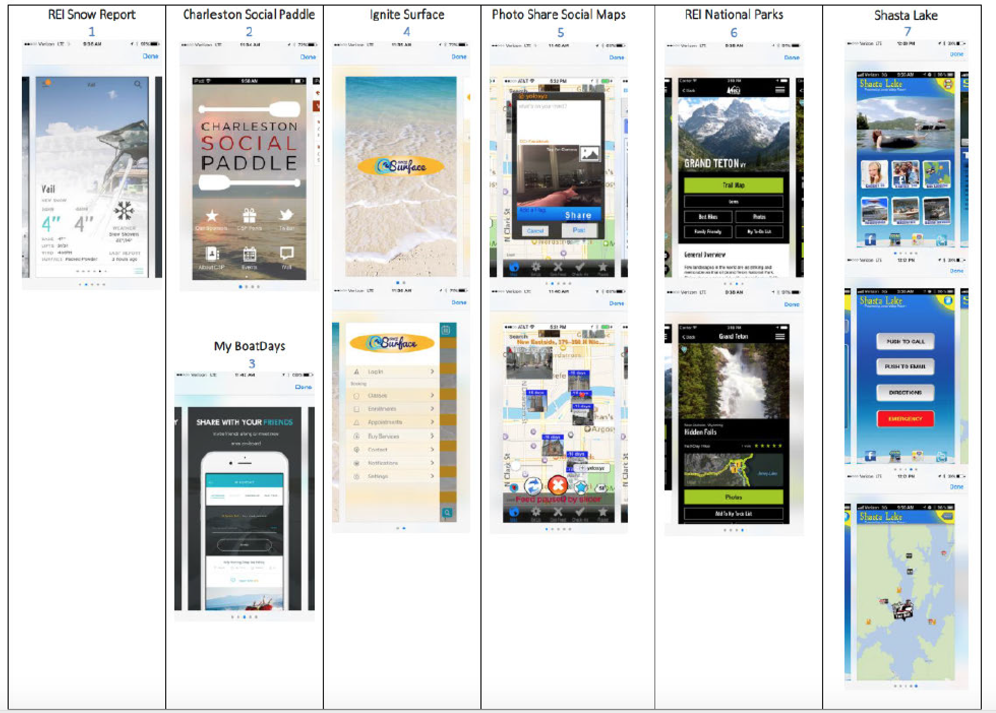
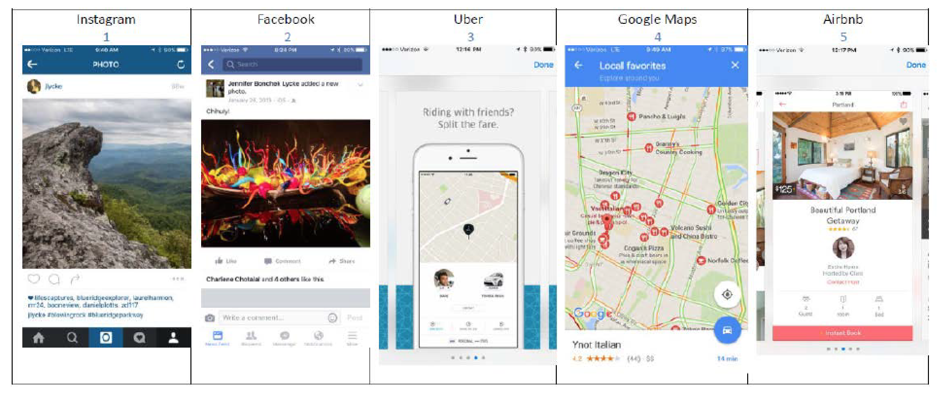
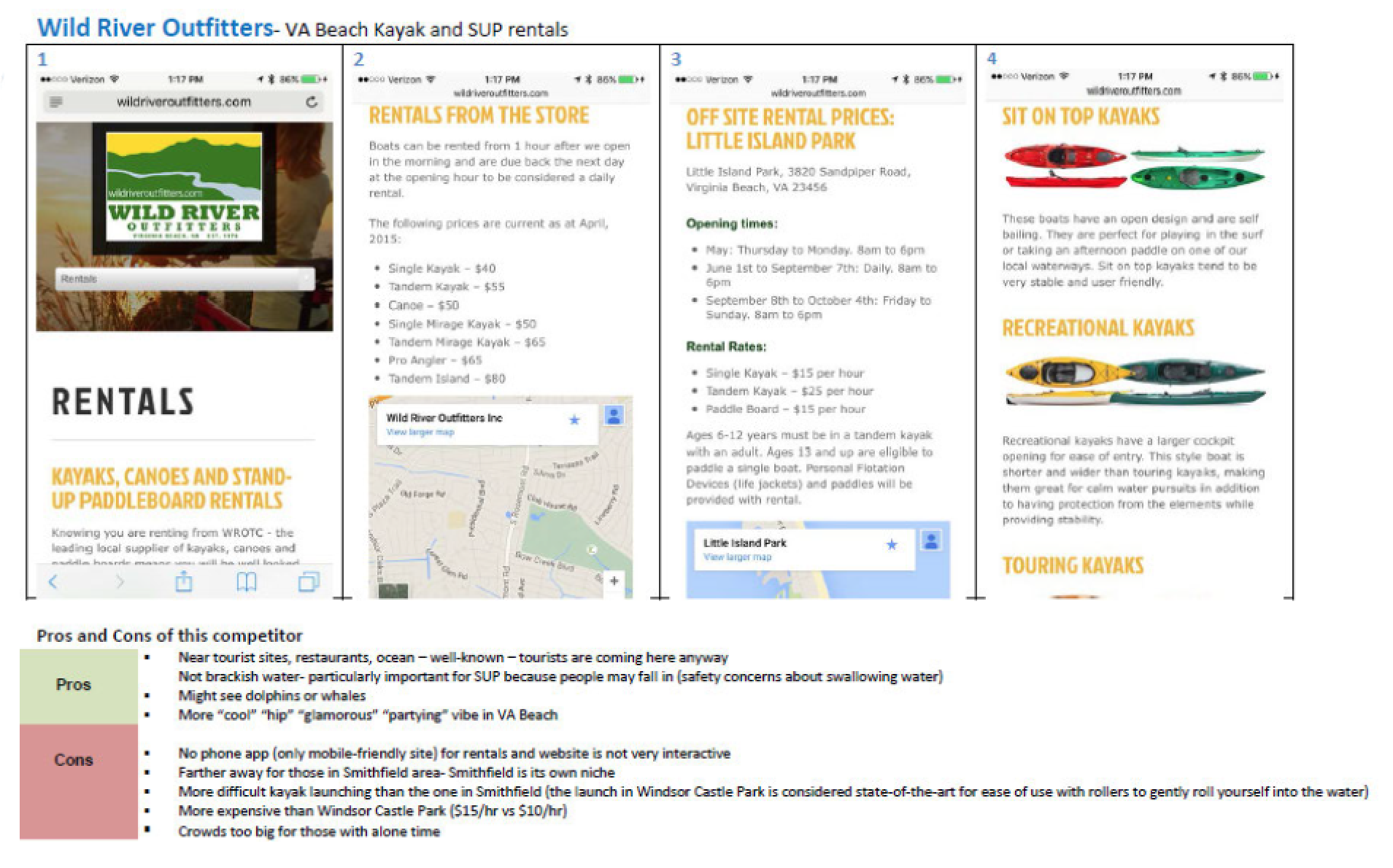
In-depth competitive analysis was performed on similar brands and other apps with similar functionality. Pros and cons of the competitors were analyzed, and design features that could be helpful for the Castle Kayaks app were researched.
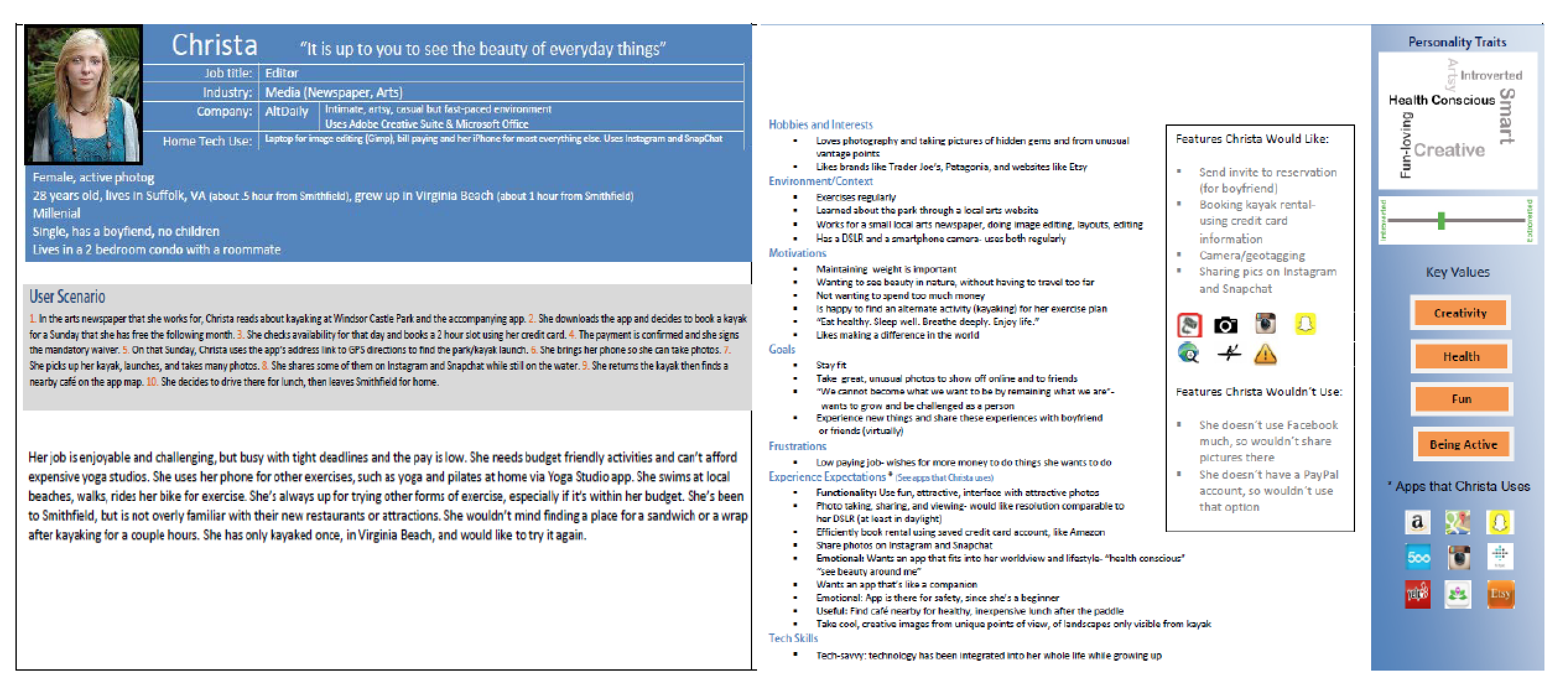
Personas
Personas were created based on research of potential users, based on their kayaking hobby and experience going to area parks
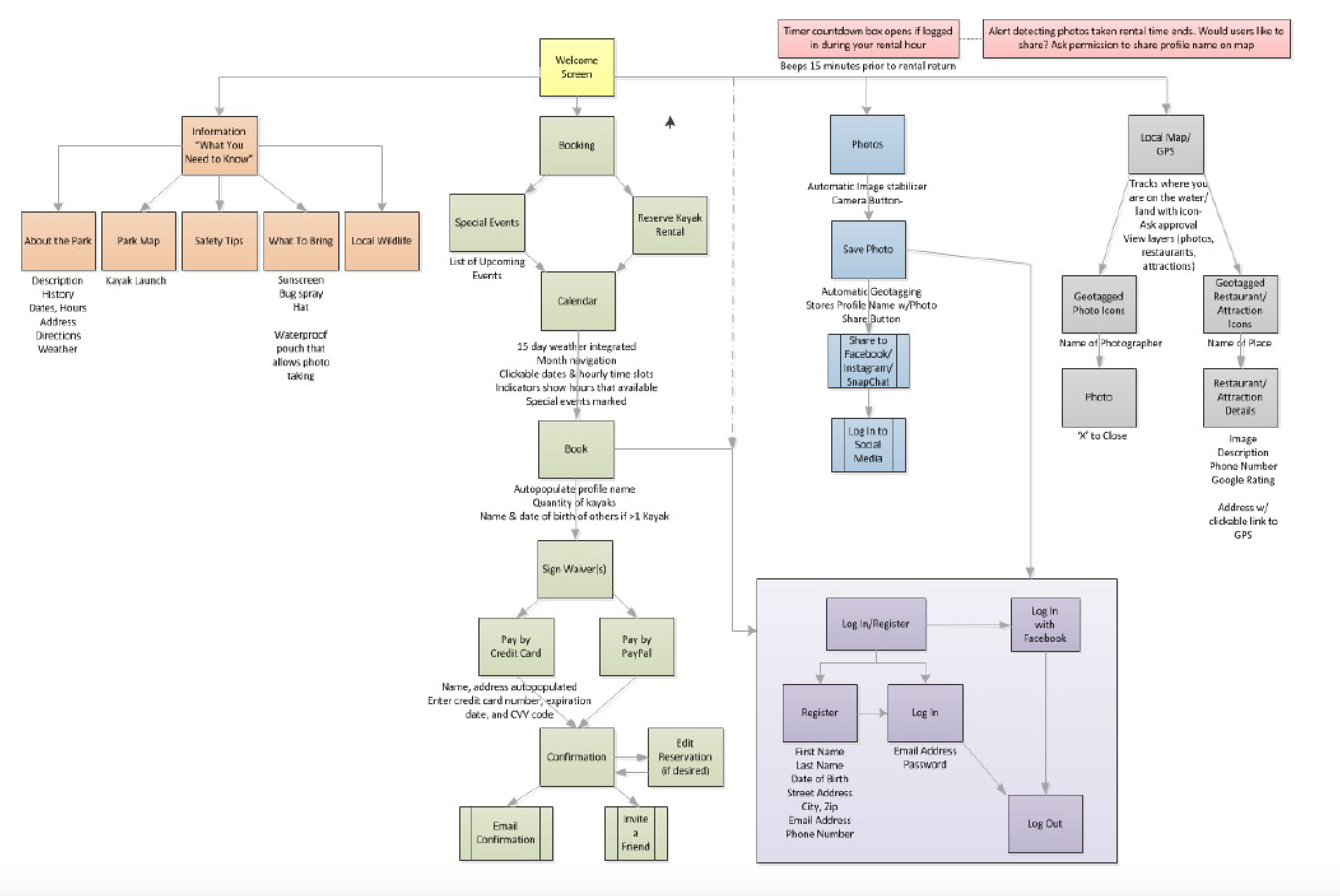
Site Map
I thought through the logical order of the user flow. This helped determine the necessary screens to perform taks easily and without confusion.
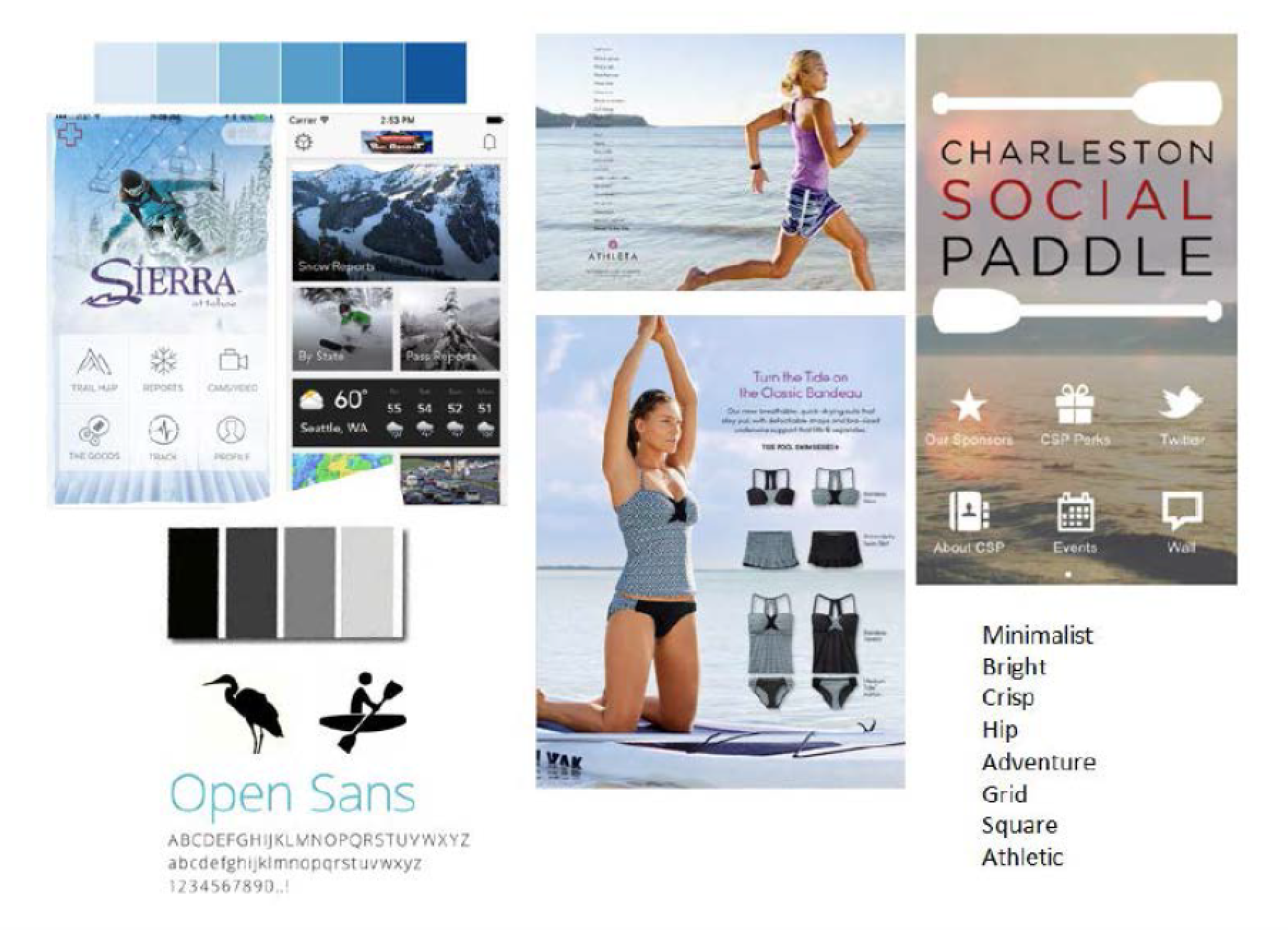
Ideation
A moodboard was created and design aspects of other similar apps were studied.
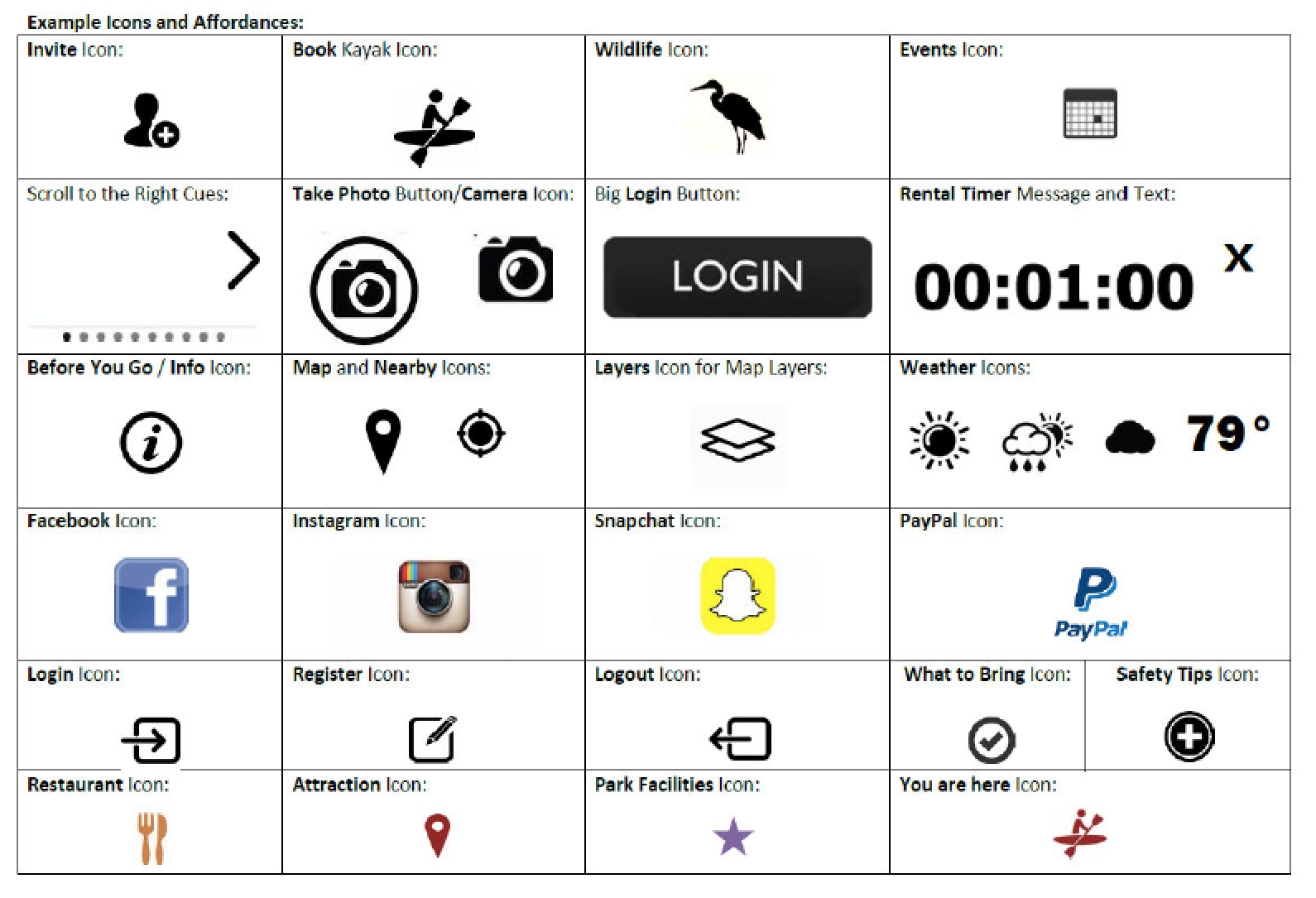
Iconography
A design system was created to determine effective iconography for the app.
Wireframes
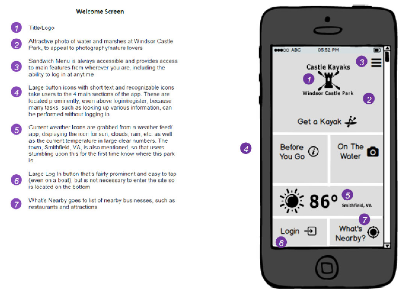
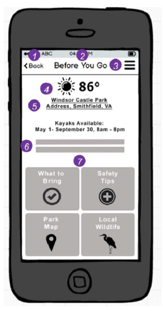
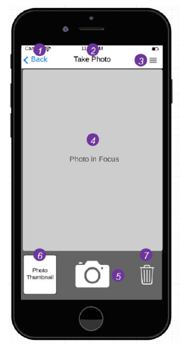
Lo-Fi wireframes were created and annotated for further clarification.
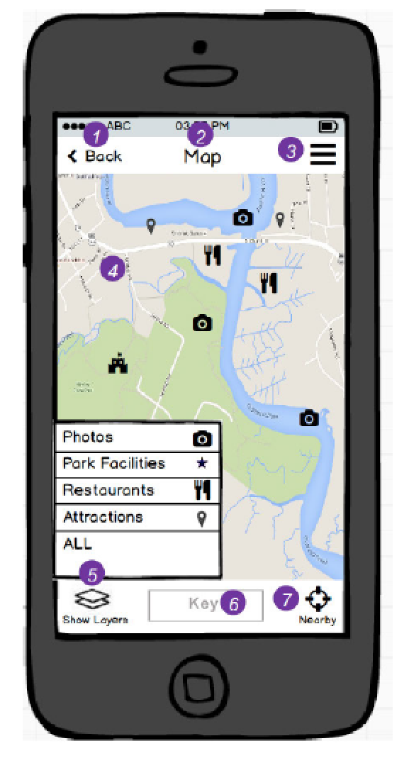
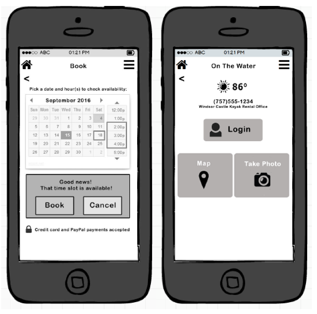
Mockups
Based upon feedback, primary screen mockups were created in high-fidelity, then iterated upon after additional rounds of feedback.
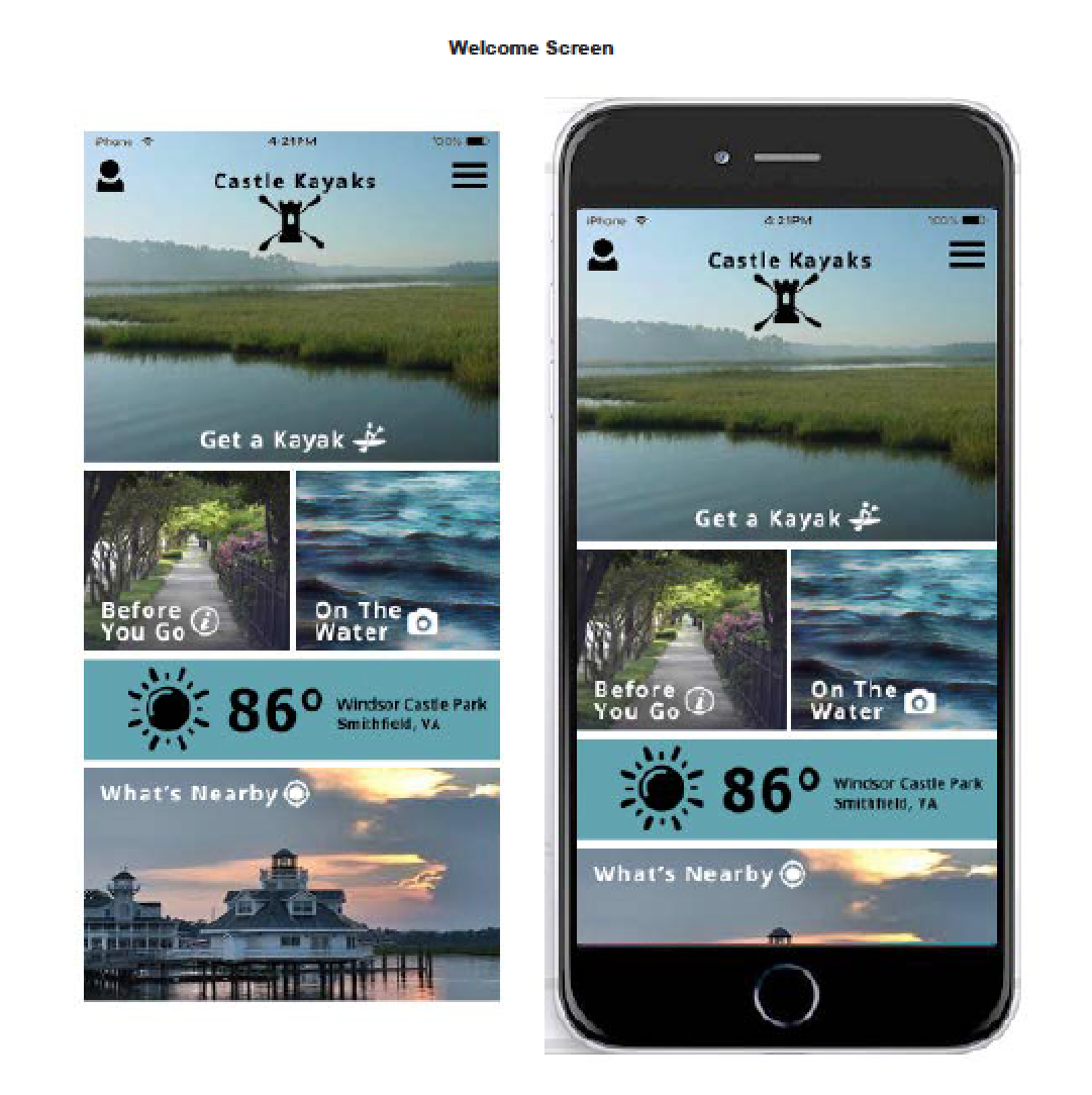
Accessibility considerations
1. Large buttons with high contrast were created for the screens that would be used while on the water, so that sunlight and the elements would not prevent usability.
2. Audio timer enabled use while users are on the water paddling.
3. Clear icons were used to aid understanding.
Takeaways
Impact:
Users would now be able to easily book reservations online, without needing to play 'phone tag' with the business. Users would be able to use the app from initial booking to activity completion, and all the steps in-between. Usage of the app could improve safety and knowledge for the paddlers, give more time to the outfitter to concentrate on user safety and enjoyment, and bring in more visitors to the park and surrounding town. It is expected that tourism revenue would increase due to the increase in park visitors.
What I learned:
I learned to think through the user's journey to discover features and functionality that would be useful to them. I also realized that we must consider the environment that users will be utilizing the app in. For example, if people want to start a timer, take photos, or discover nearby wildlife while paddling on the water, the interface needs to be simple, have large distinct buttons, and incorporate auditory features where plausible.
 Back to Home
 To Top of Page
Contact
Email: jenlycke@gmail.com
Phone: (757) 477-1244
